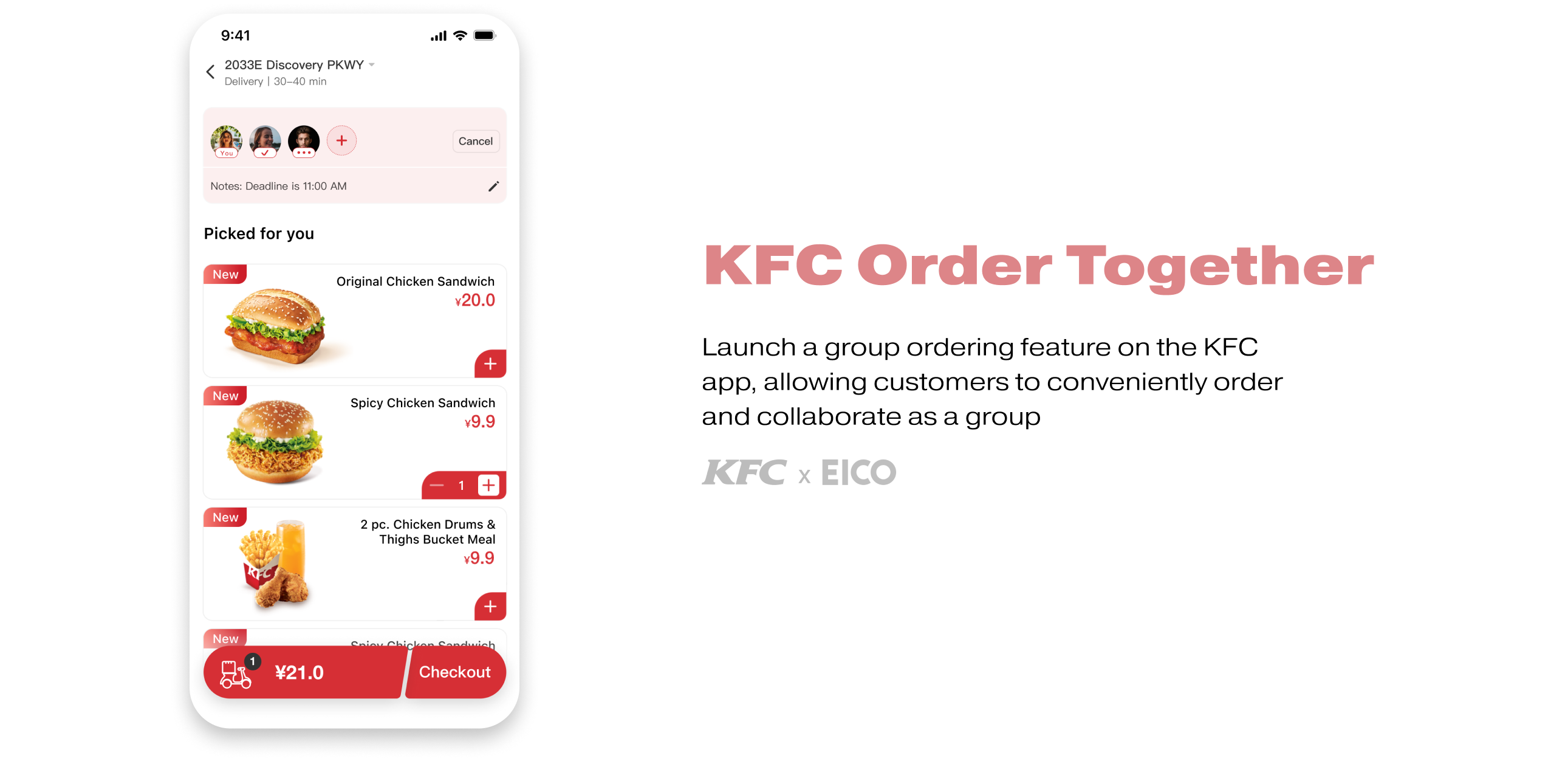
KFC China aims to introduce the collaborative order feature to all of its business lines on its app. The collaborative order function will be available in all stores and will serve a wide range of businesses with various combinations of breakfast and regular meals, take-out, dine-in and pick-up, reservation and order now.
After conducting research, we ideated and summarized an optimal model for collaborative ordering. Then we prototyped and iterated on a collaborative ordering module that can be embedded in the current app and will be launched in a few months, serving over 10,000,000 users.
UX Designer
June 2021
UI Designer (Design System)
Figma, Sketch
We first looked into the market for existing products that had a shared ordering function. We analyzed their design according to their business.
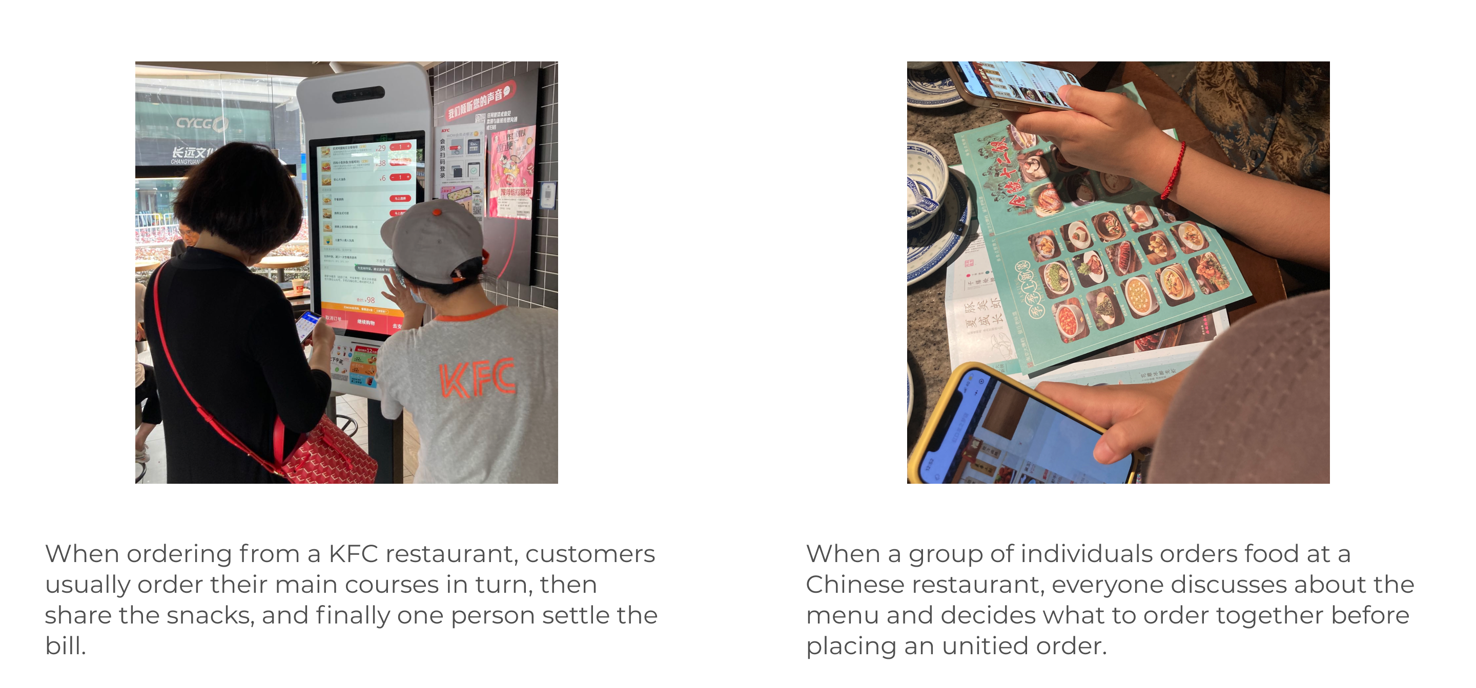
We visited the site to observe how users order food in a multi-person scenario, rather than recruiting interviewees due to time and budget constraints. We chose the Hongkou district KFC and other restaurants which provide both offline and online ordering for comparison as the observation location.
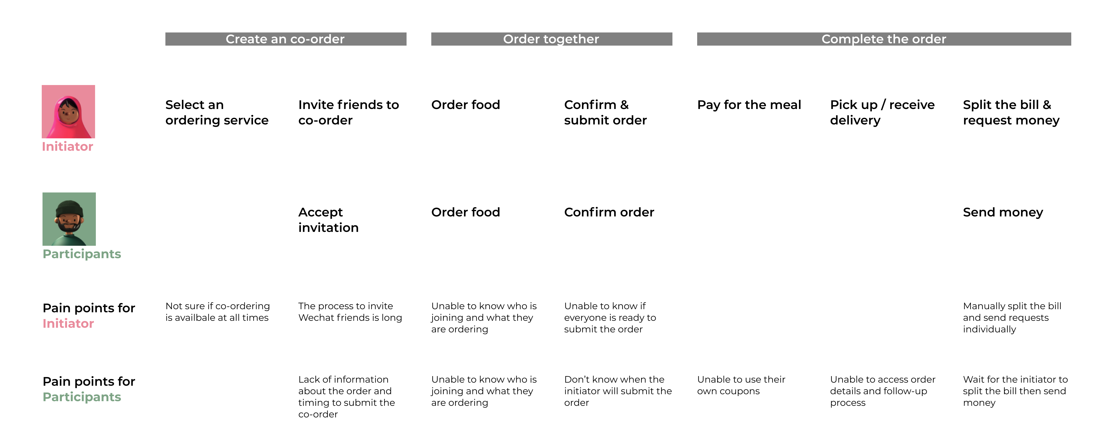
I created a User Journey Map to analyze the pain points for both initiators and participants in multi-person ordering, based on KFC's initial collaborative ordering idea and other benchmarks in the market.
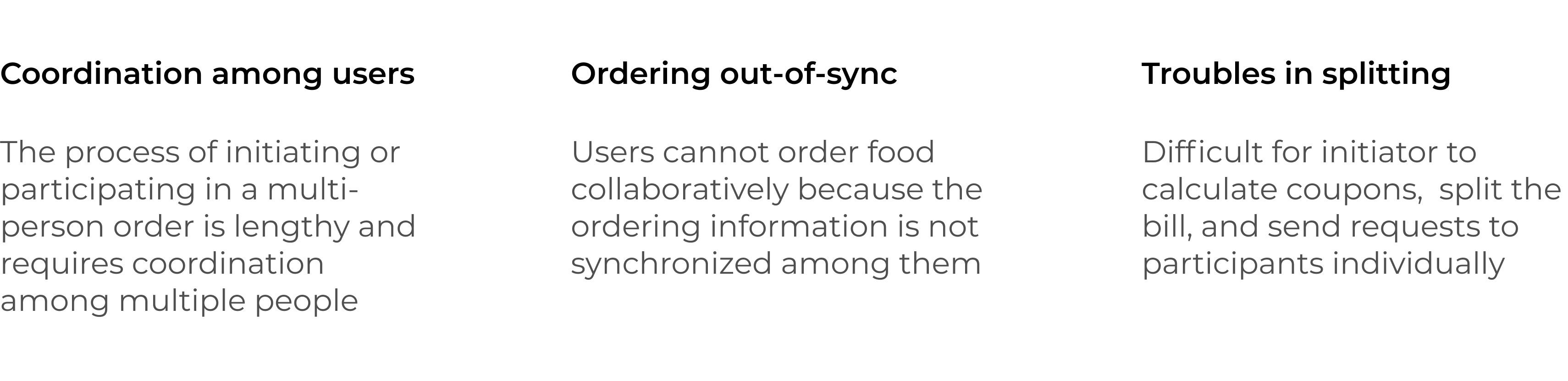
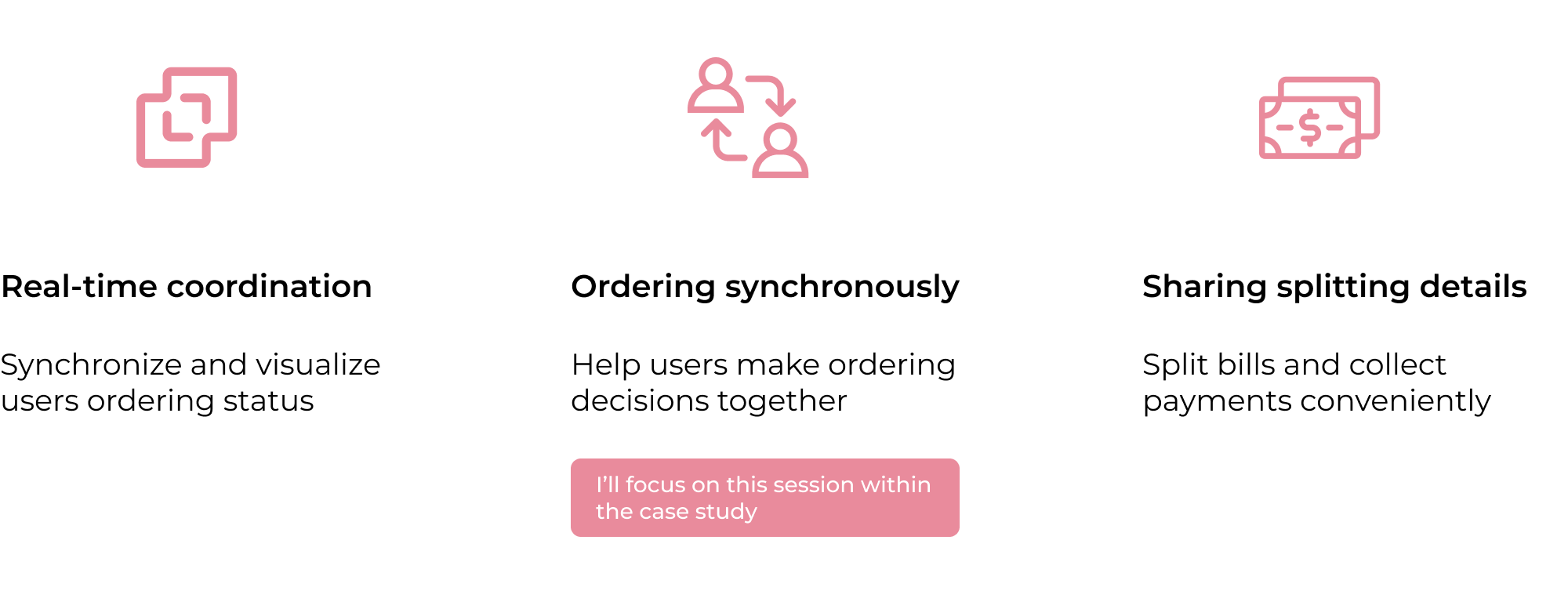

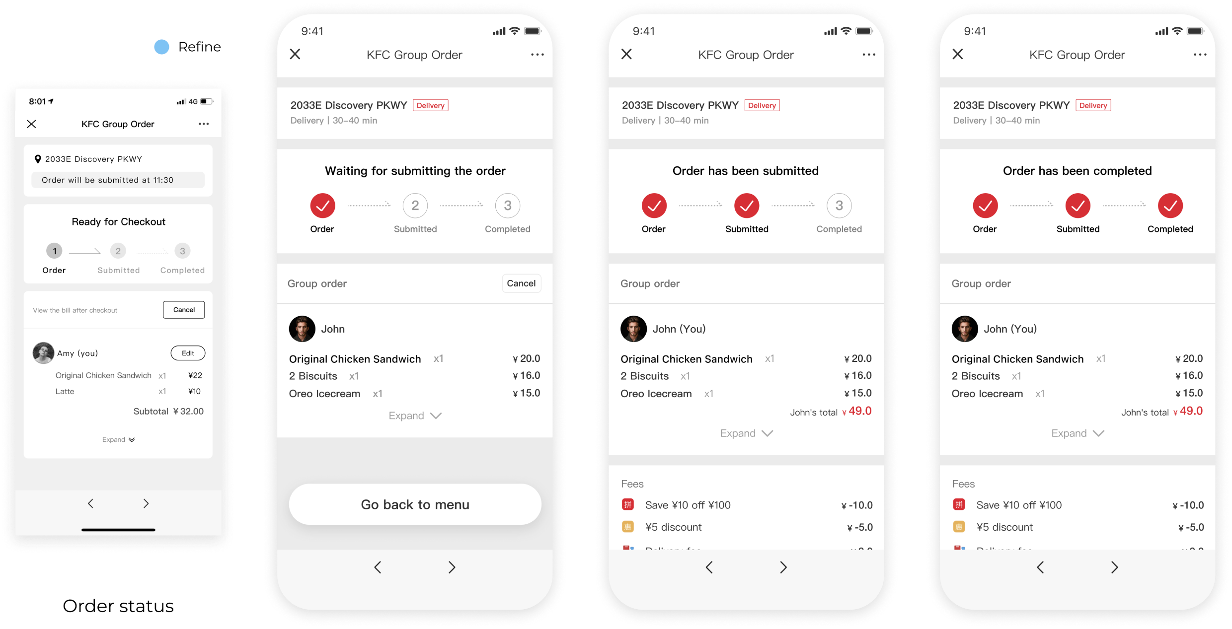
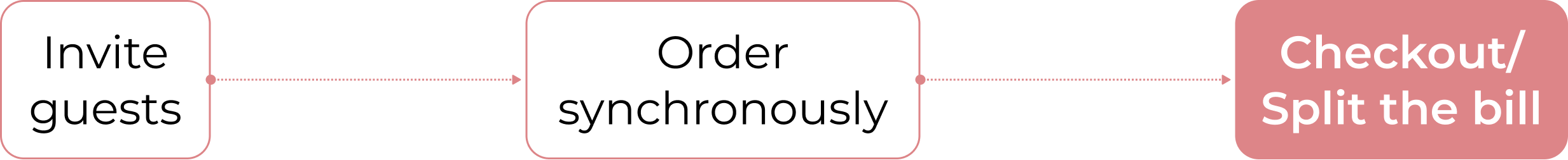
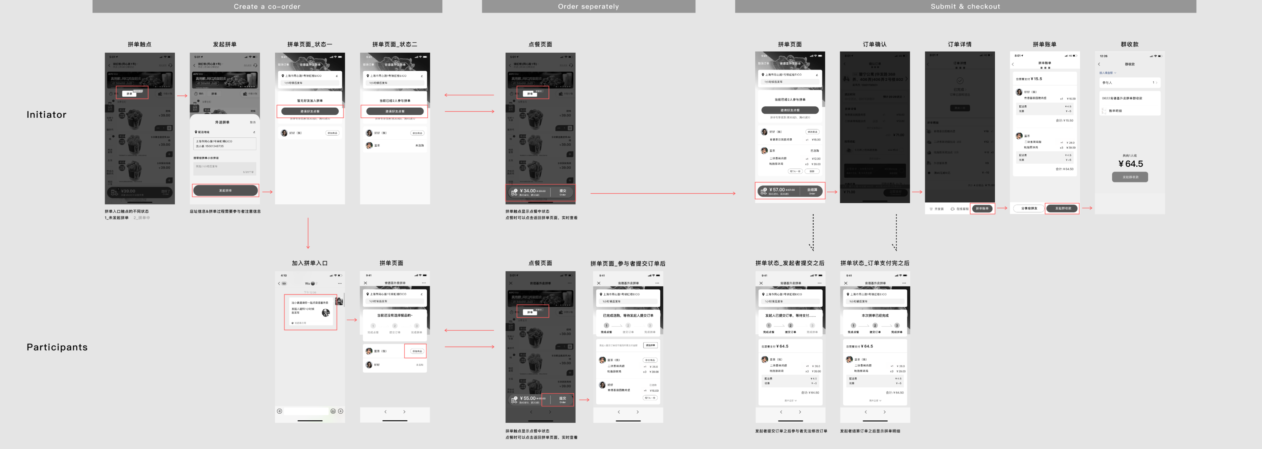
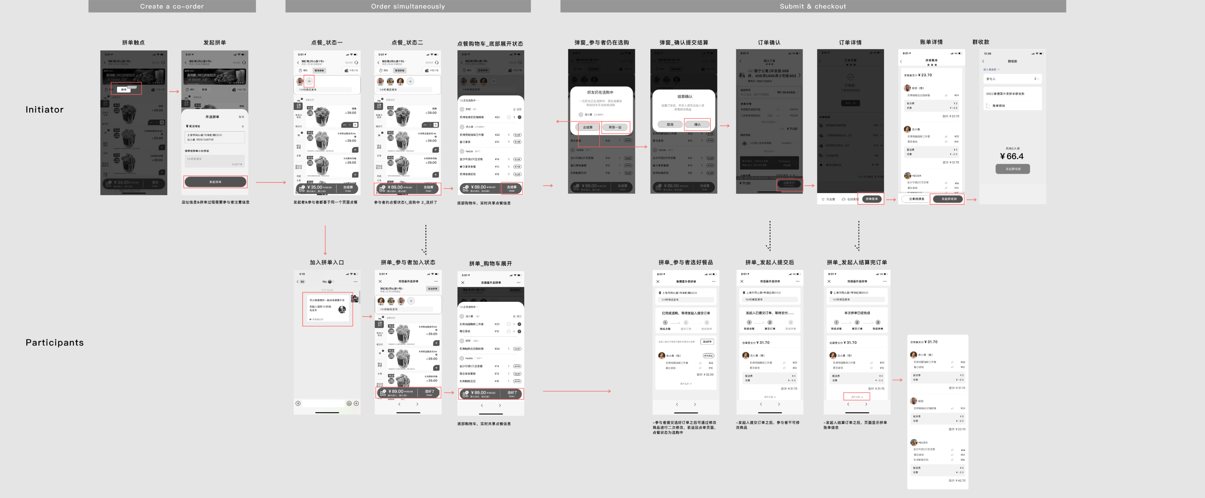
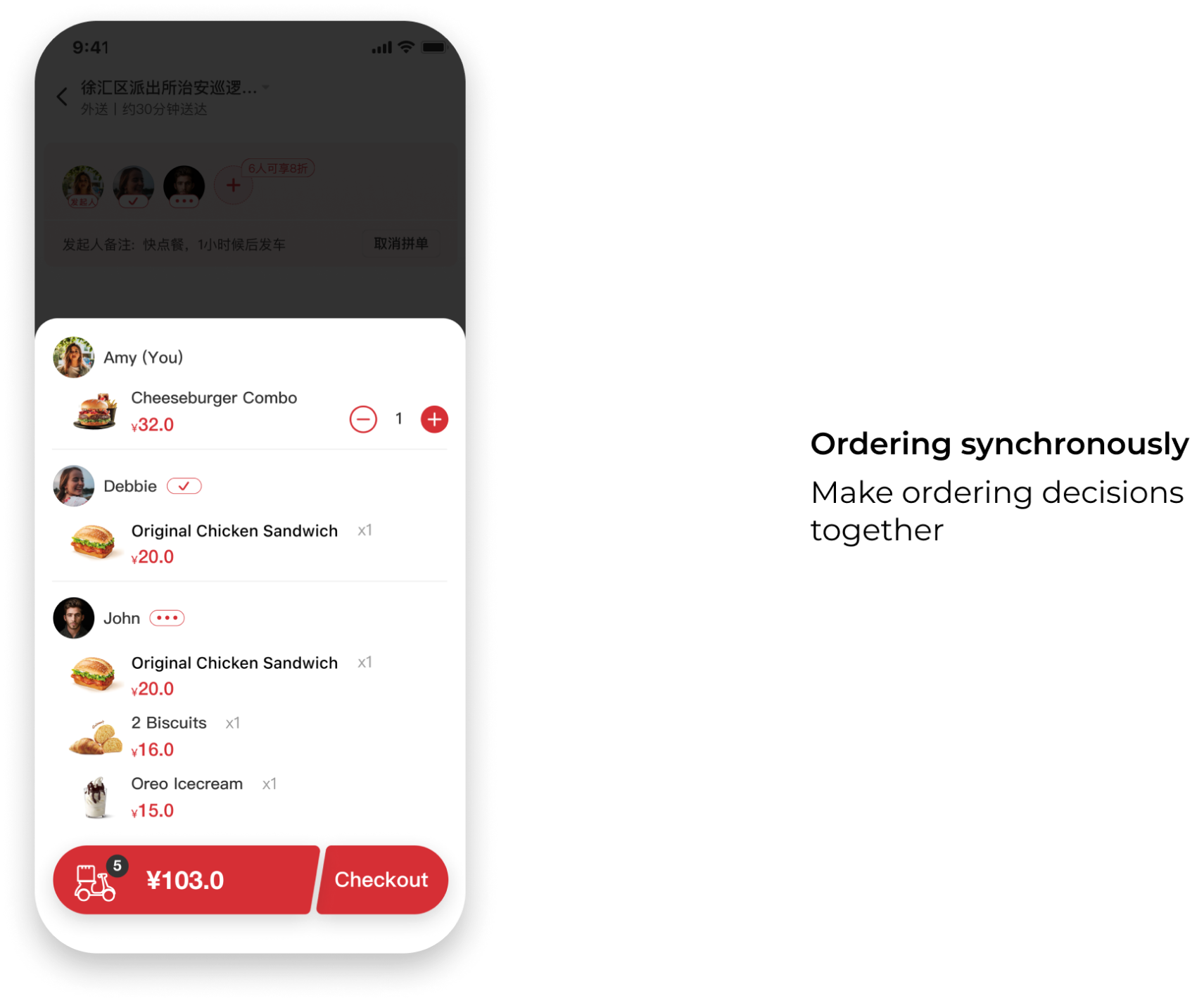
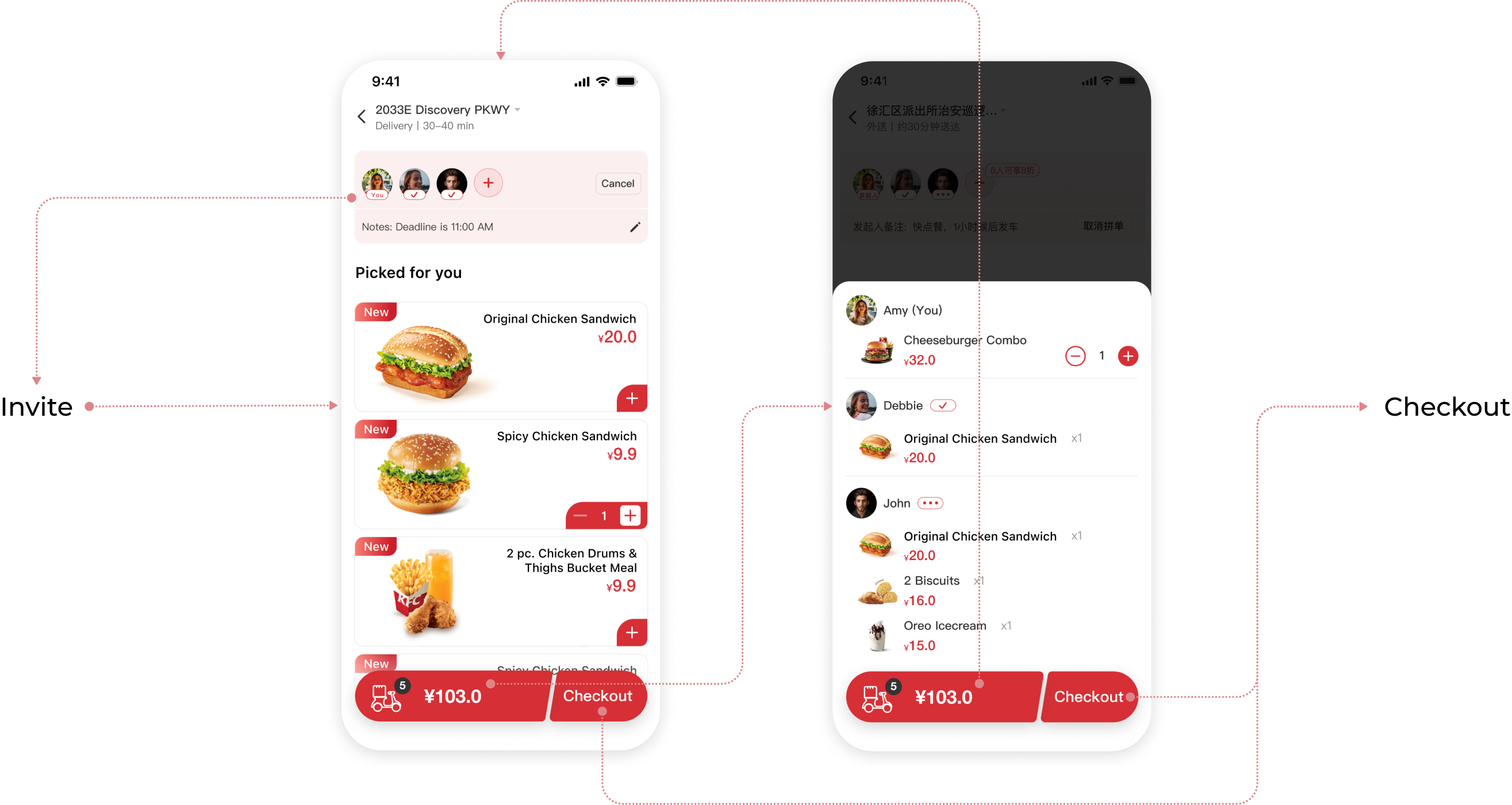
To clarify and condense my user flow, I've divided it into three sessions: before, during, and after. These align with the three main takeaways I've determined. Since the Order Synchronously part is crucial and establishes the mechanism, I began with this part.
Based on the data from the user research, we reconstructed two different collaborative ordering user flow models and designed two solutions in turn.
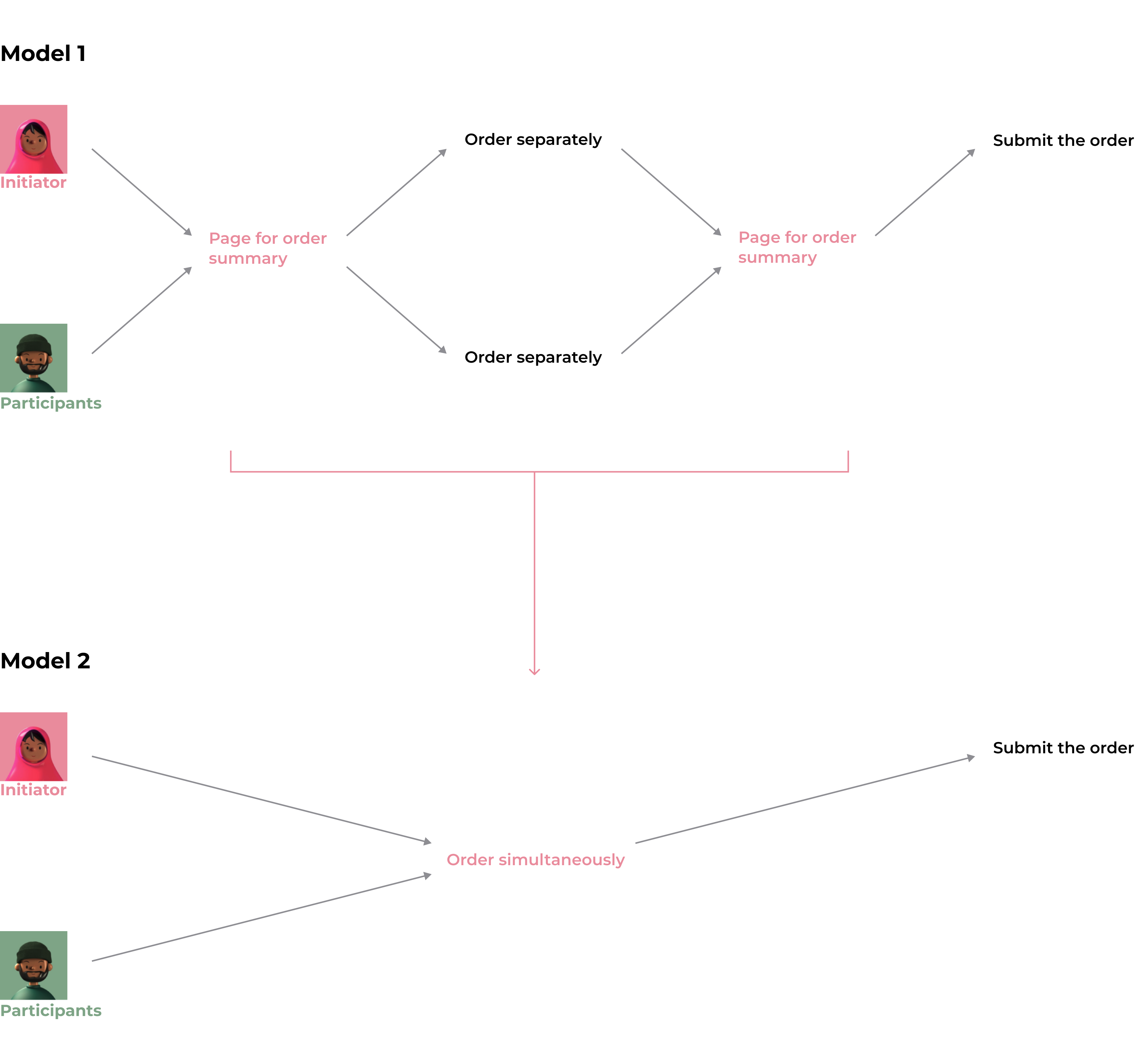
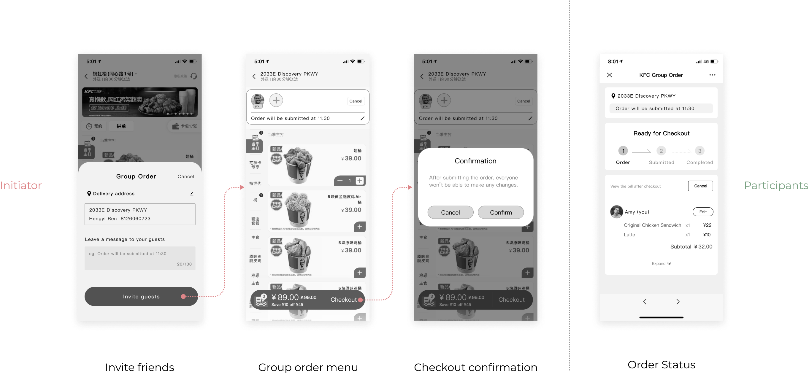
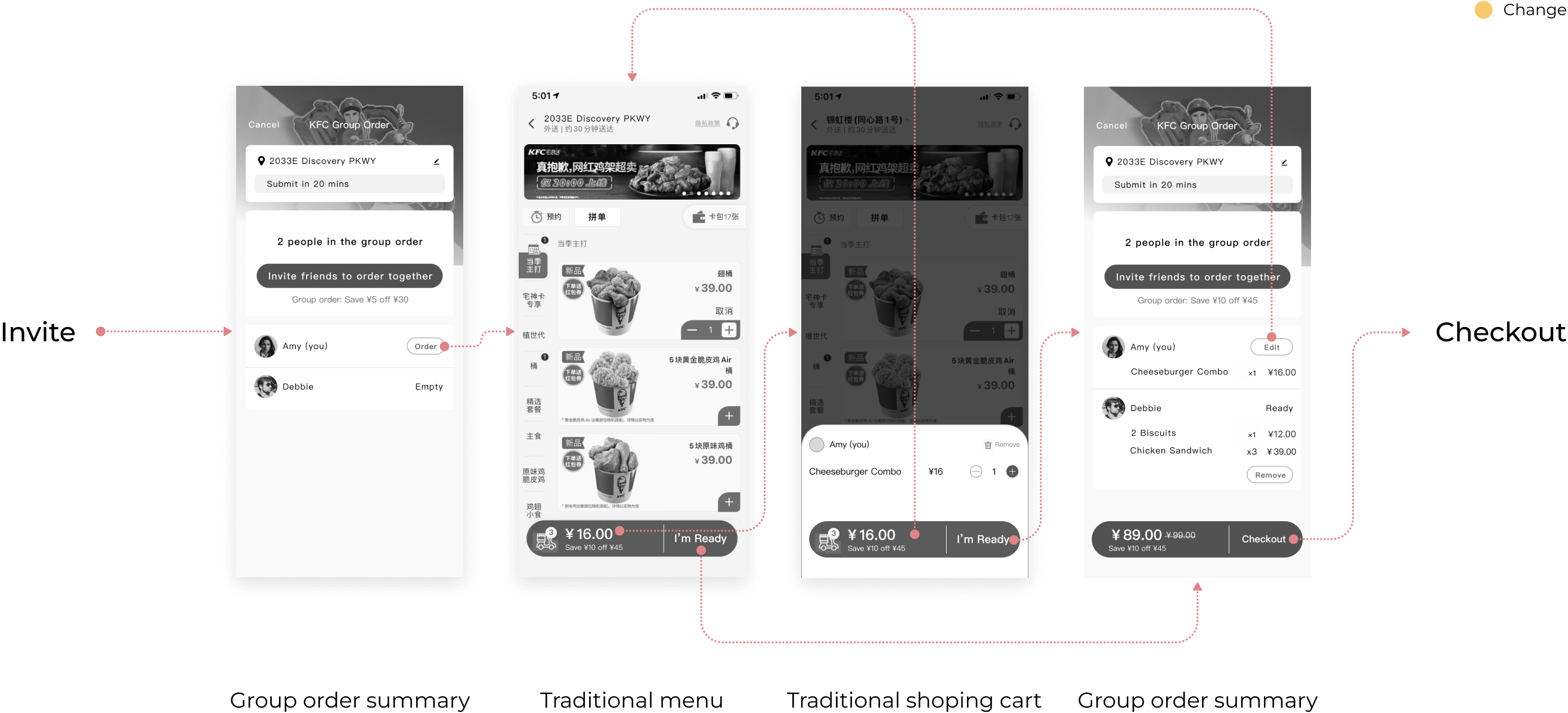
The first one is the existing collaborative ordering process in the market. The initiator sets up a coordination page and sends out invitations to the participants, who then go to the page and place their orders on their own. They return to the coordination page after confirming the order and wait for the initiator to submit the order and pay.
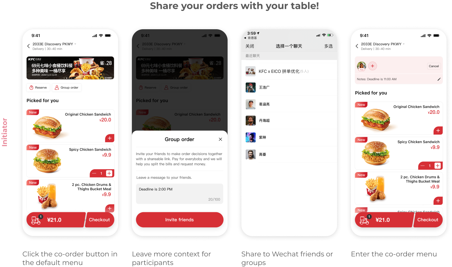
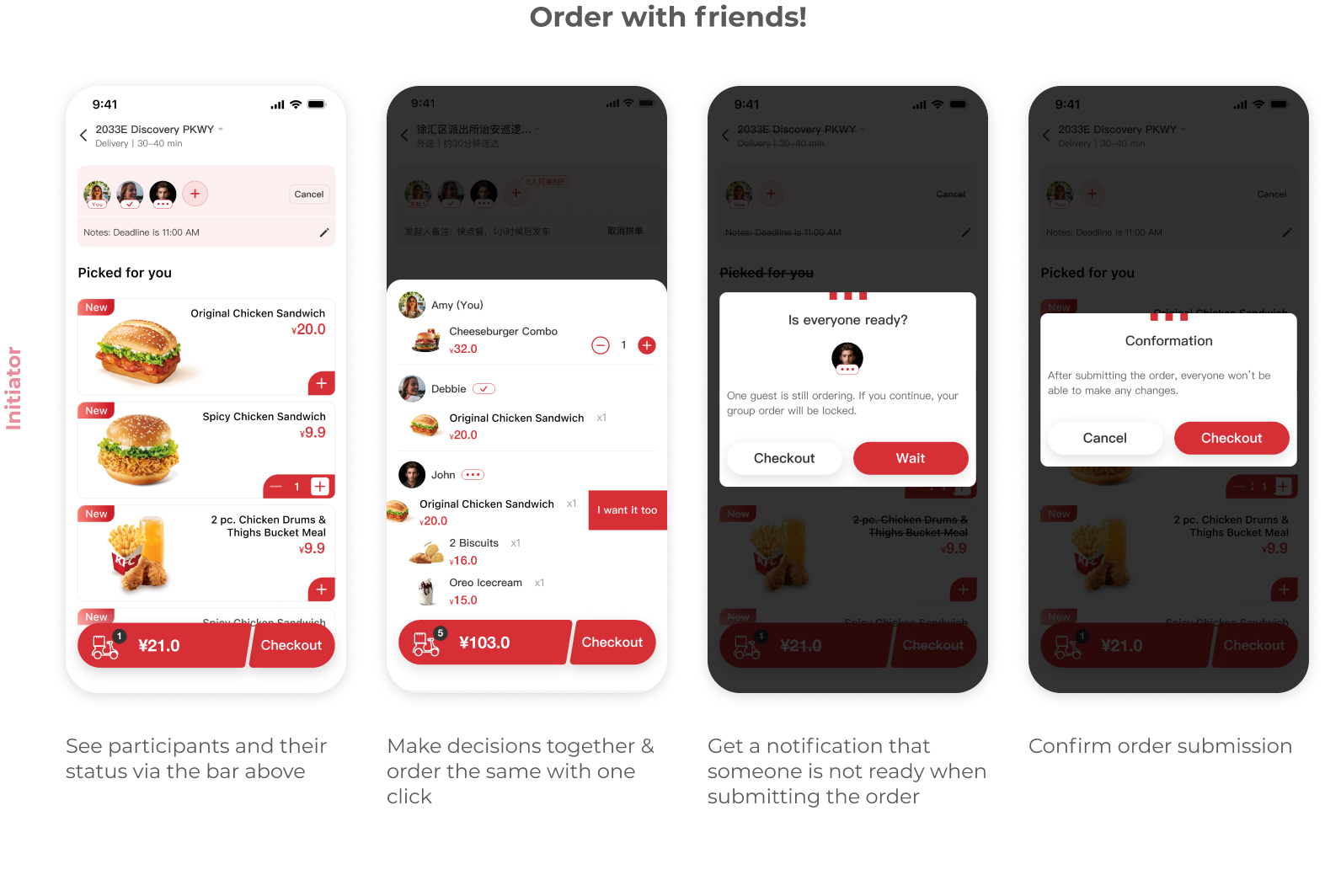
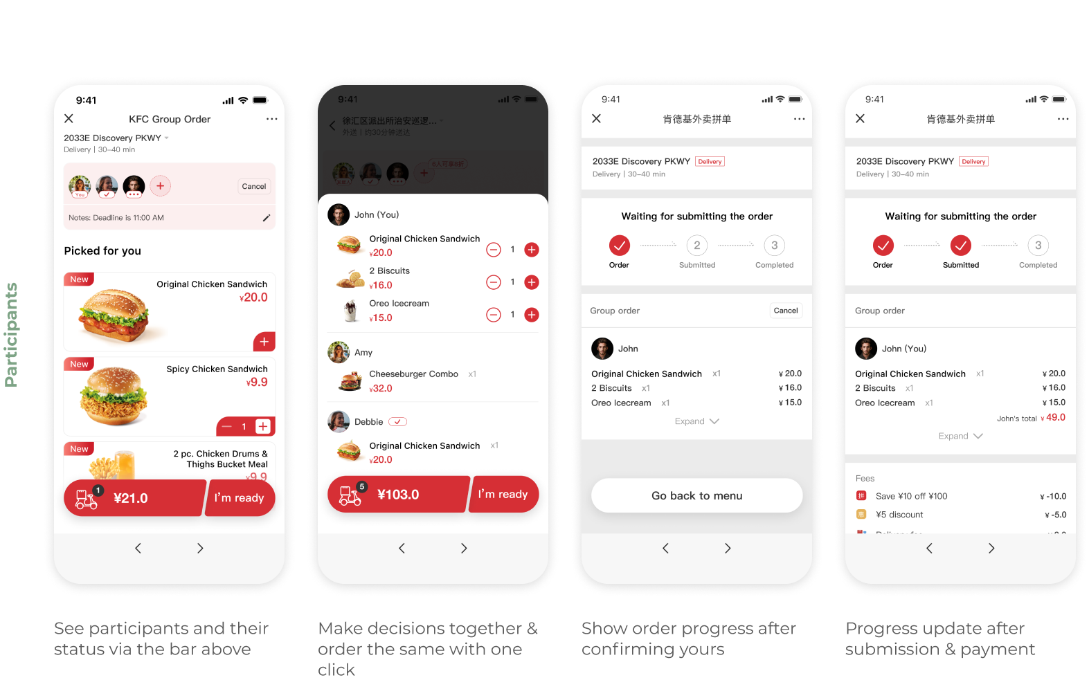
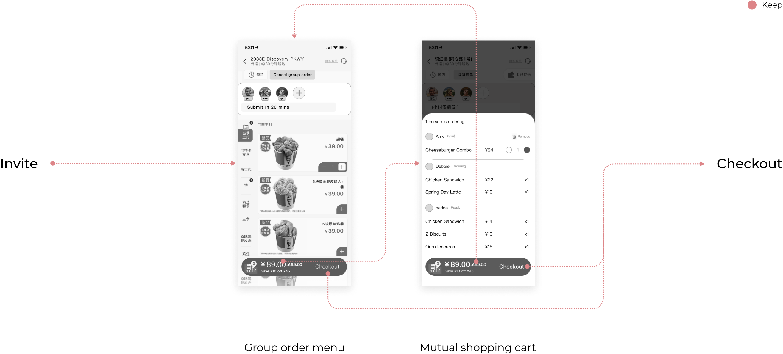
The second one is that the initiator directly invites participants to order together, and all participants order together on the same menu page and synchronize everyone's dishes in the shopping cart simultaneously, and finally the initiator submits the order and pays.
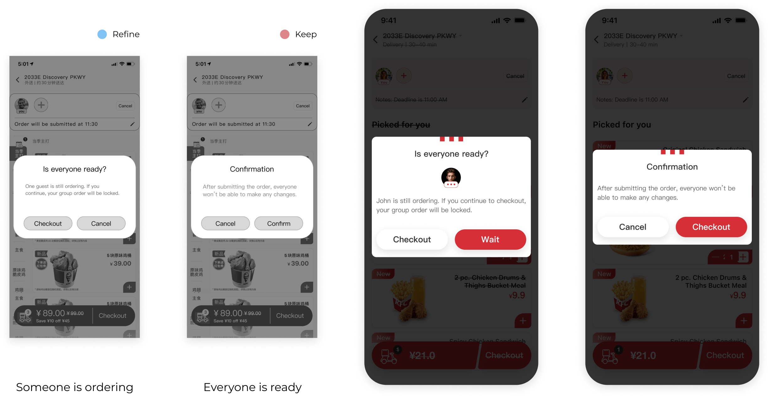
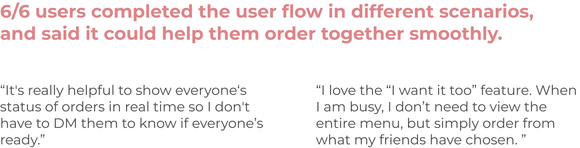
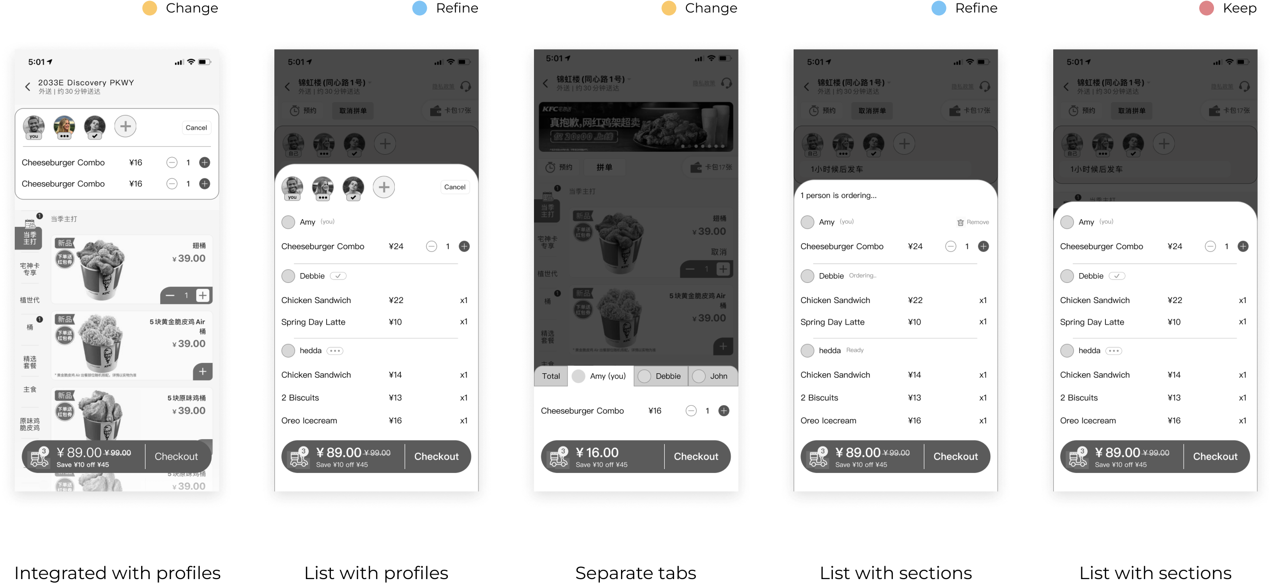
After lo-fi prototyping, usability testing took place. Most users preferred Concept 2: Order Simultaneously, because the synchronized shopping cart and participants bar made ordering information more straightforward and concise. This was reassuring to us because these two aspects are our main focus and what sets us apart from other apps. After incorporating user comments and confirming resources with the client's development team, we opted to further iterate on Concept 2: Order Simultaneously.
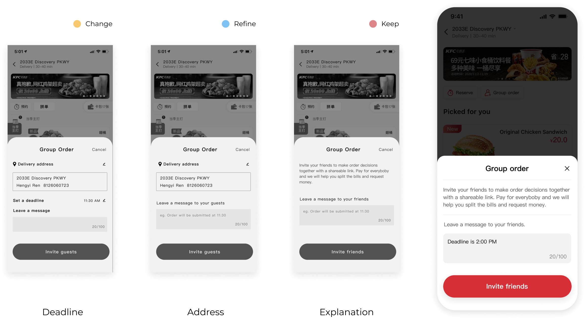
While creating a new component, I addressed accessibility concerns to during the iteration process and reorganized the hierarchy accordingly.
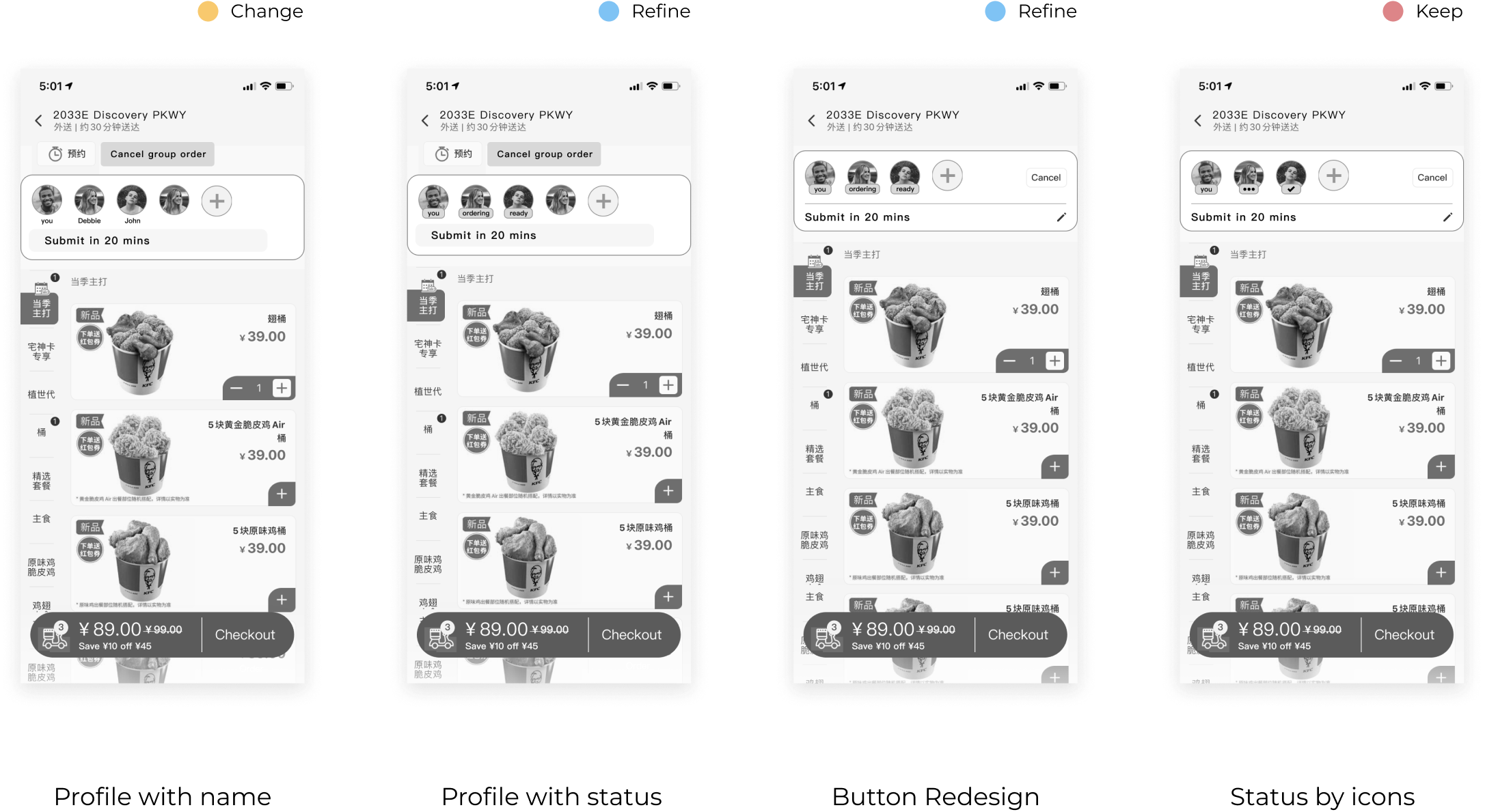
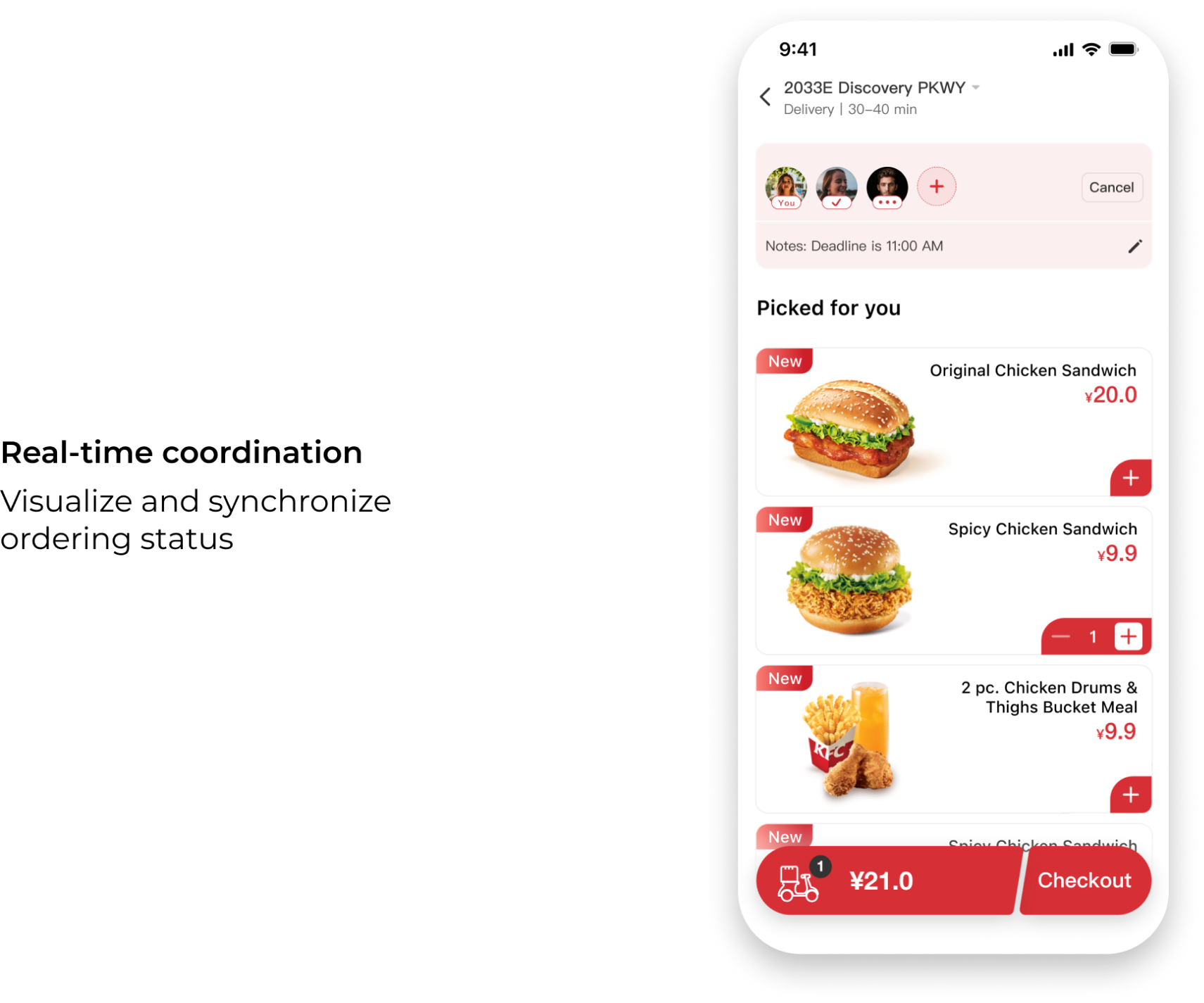
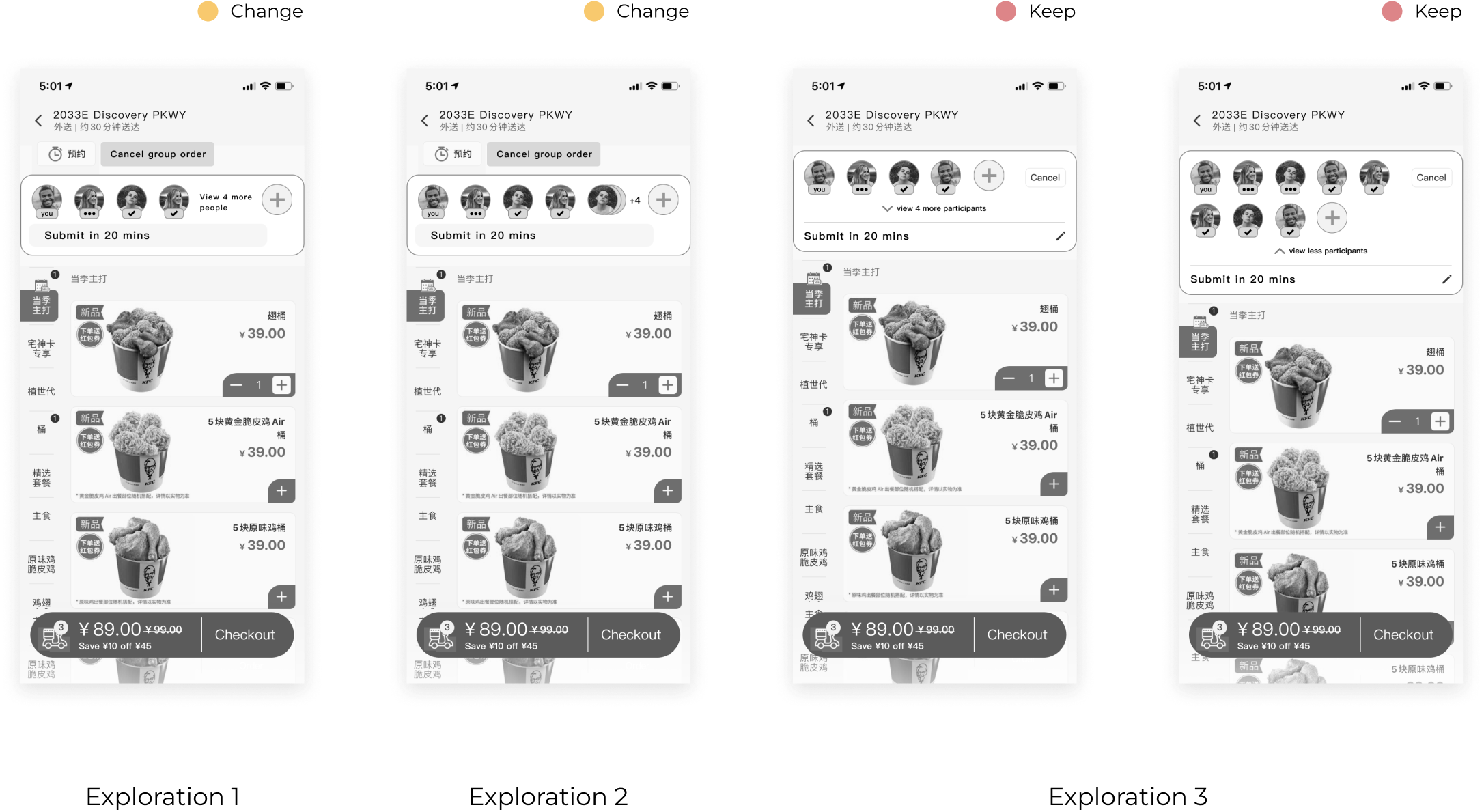
User testing feedback indicates that the icon is sufficiently small for seniors. Then I chose to make it collapsible for larger groups.
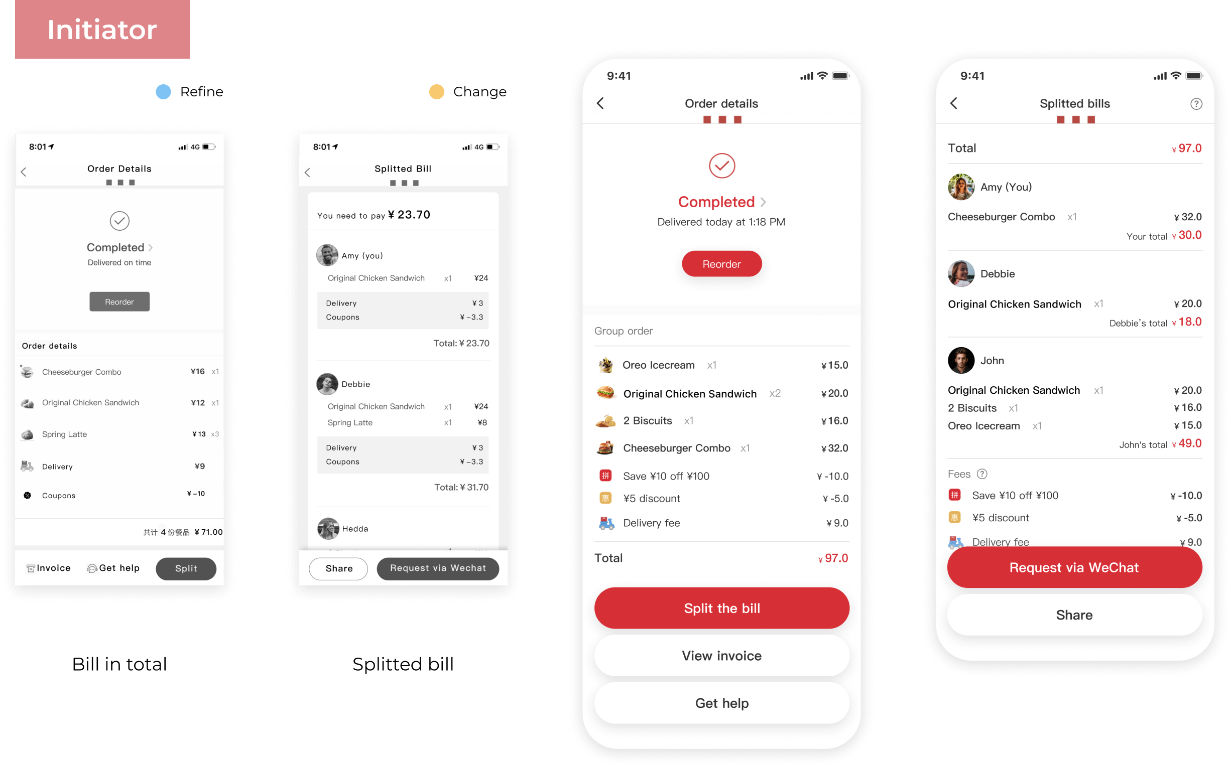
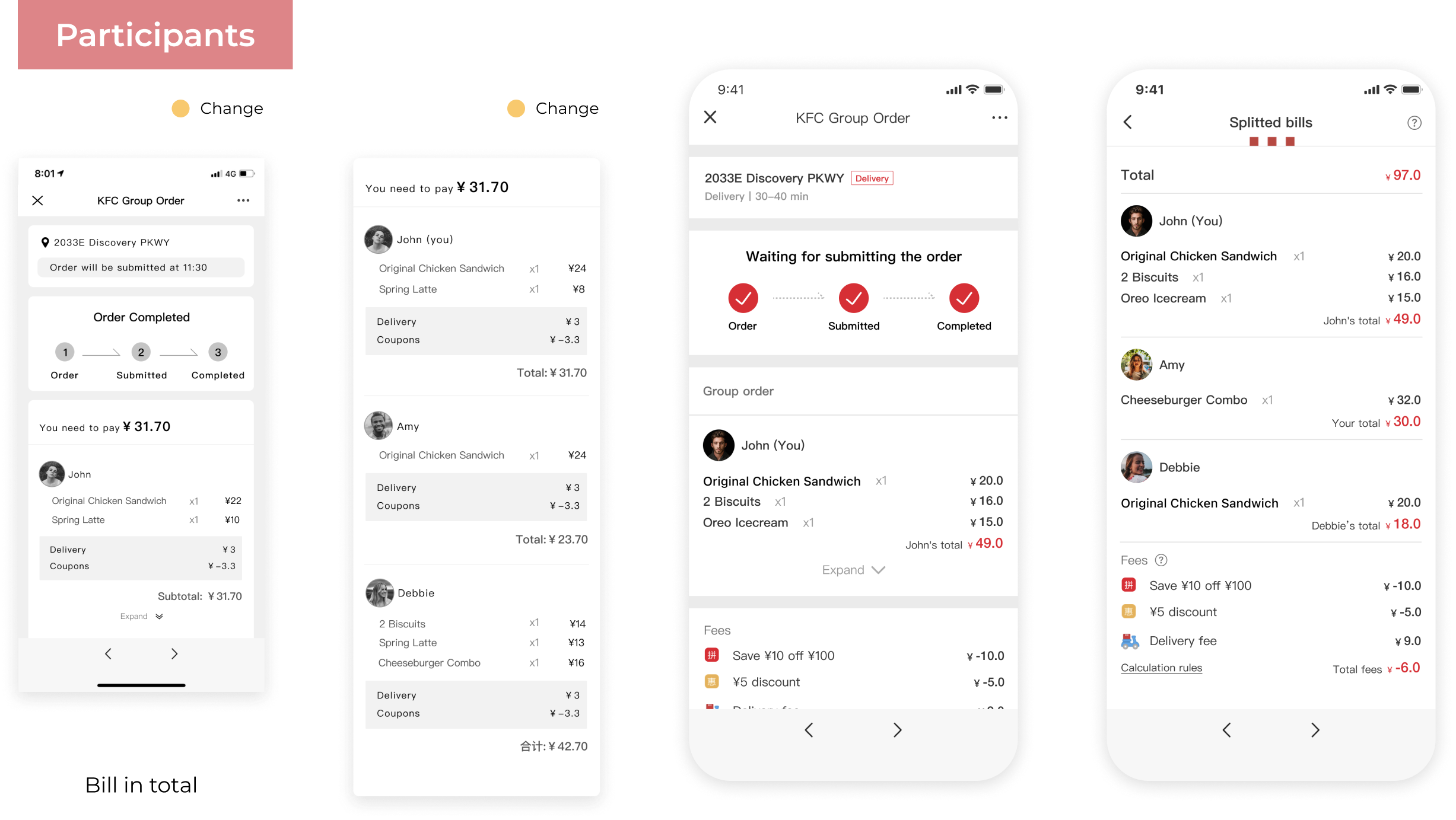
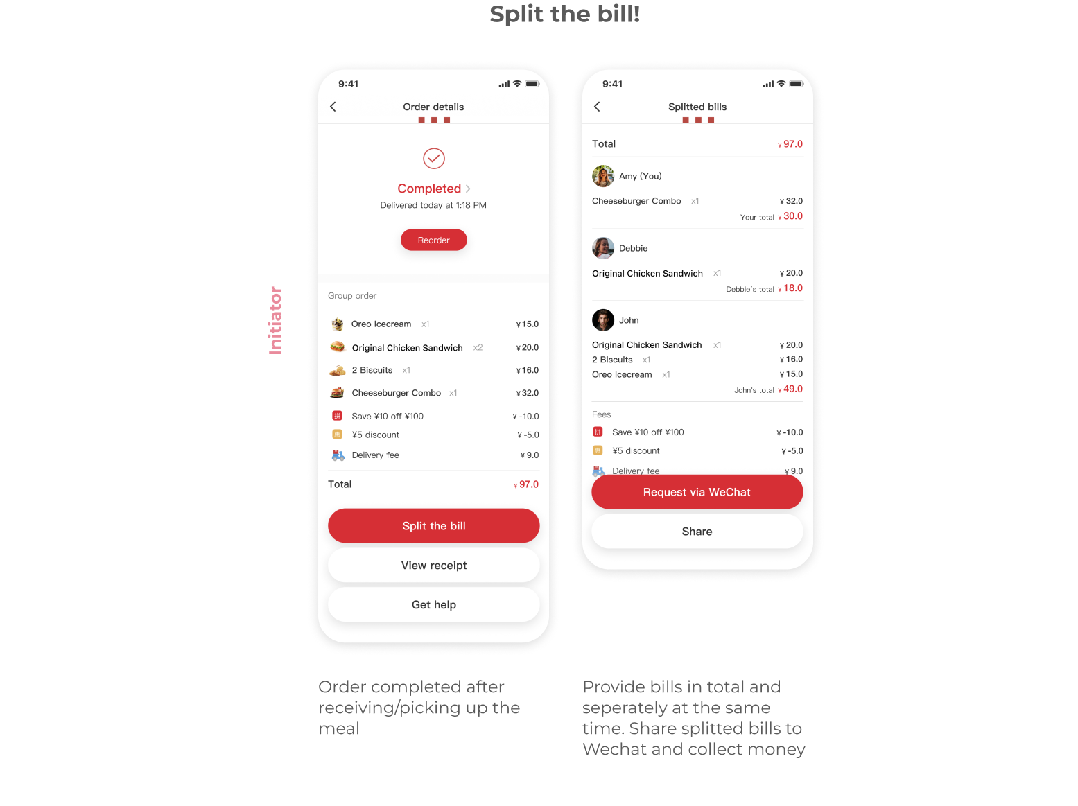
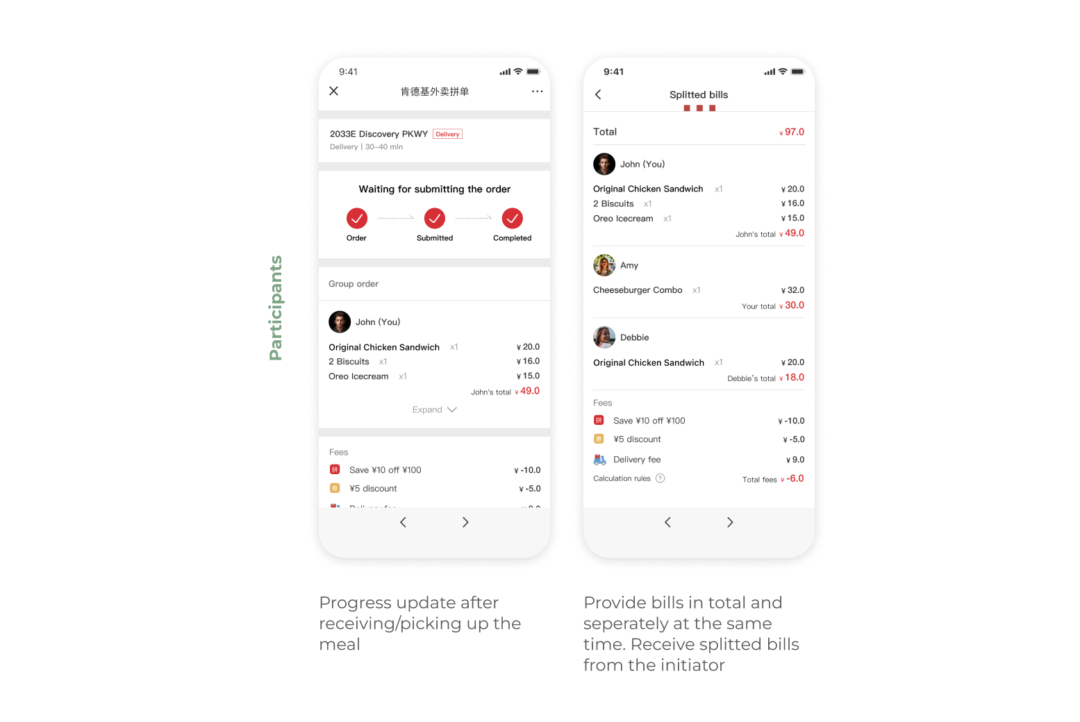
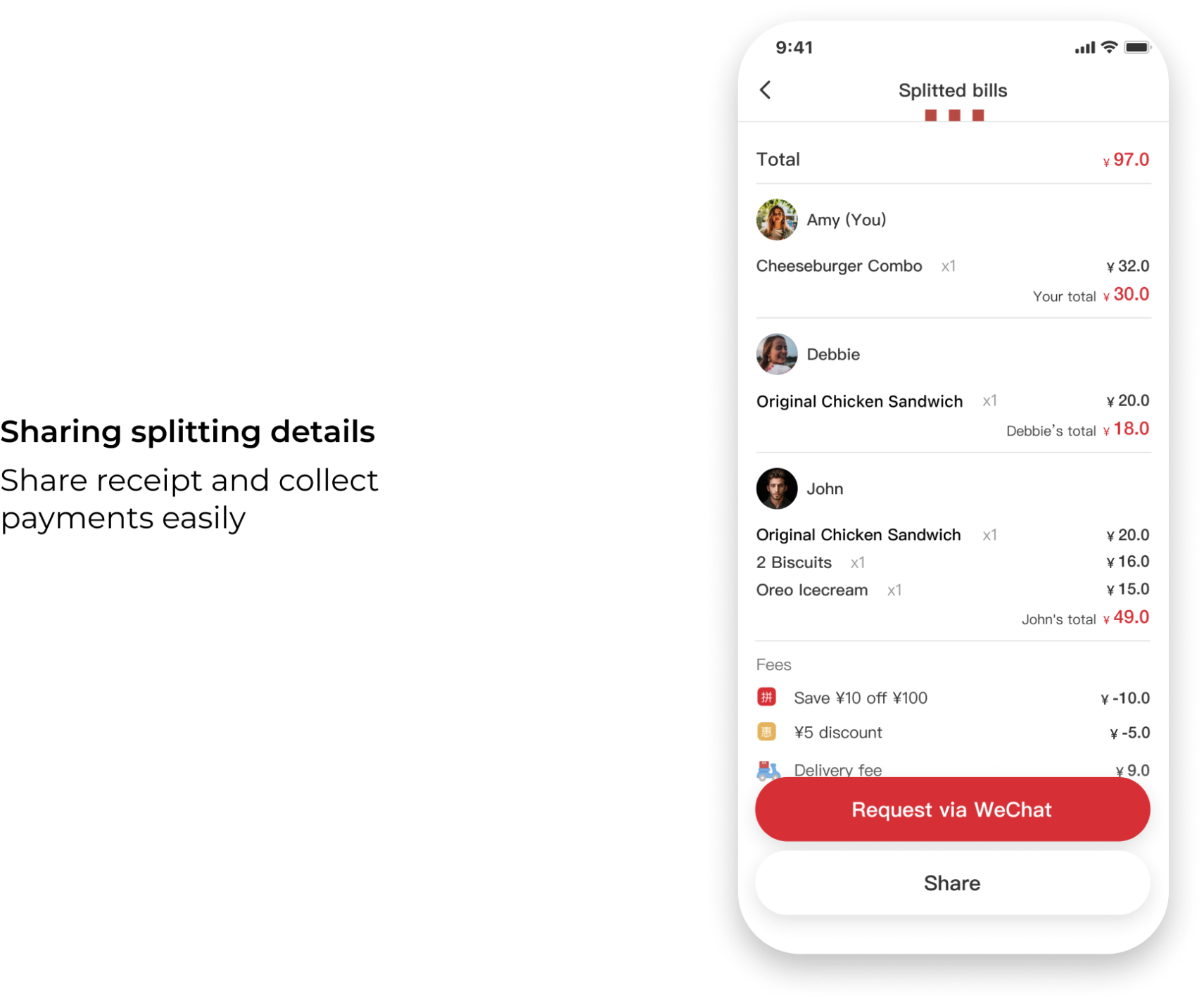
During user testing, various ideas for a shared shopping cart were explored and tested to determine the one that best resonated with users. It was found that users prefer a streamlined approach with minimal interactions, like session receipts instead of having multiple layers of iteraction.
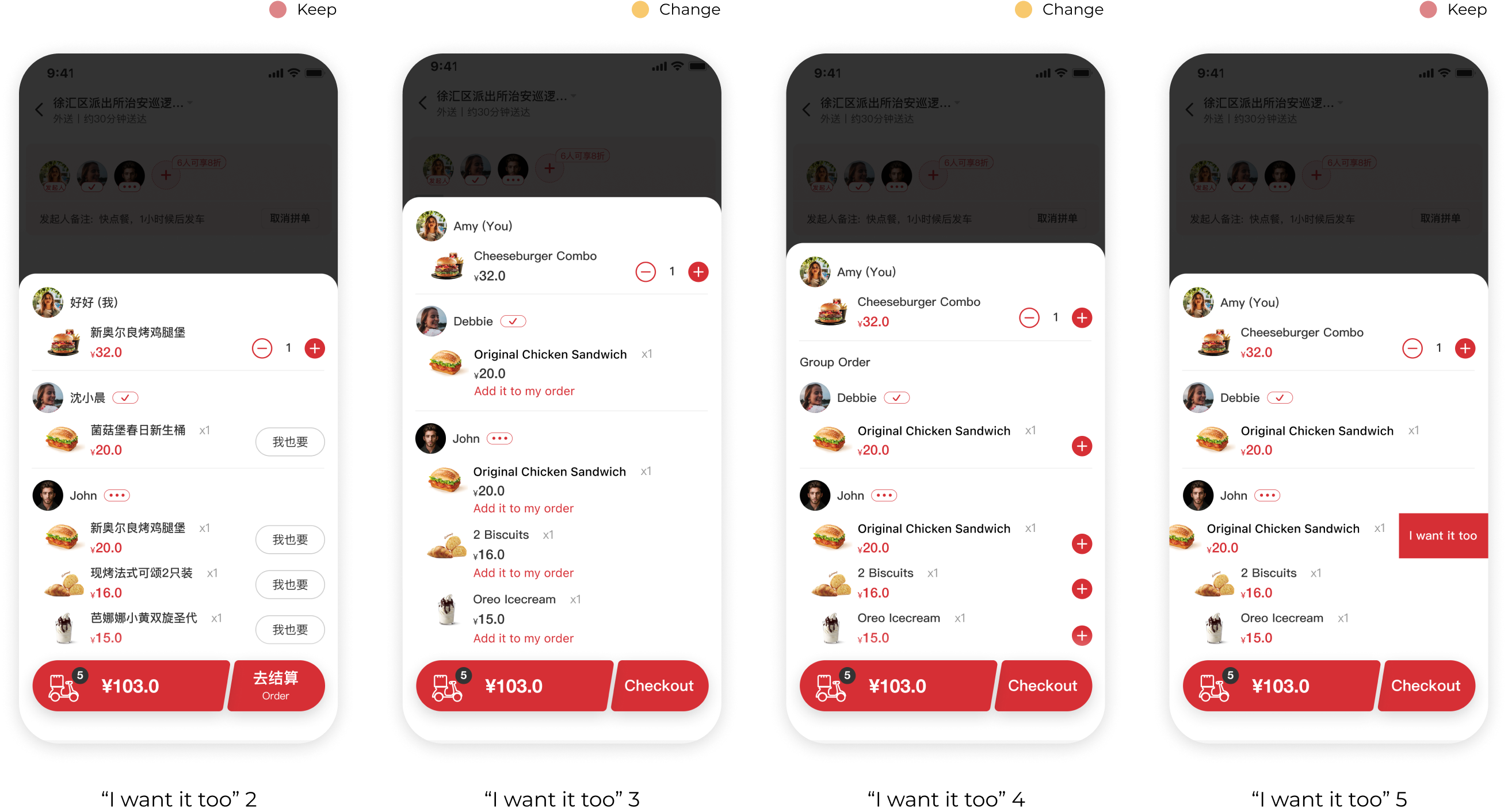
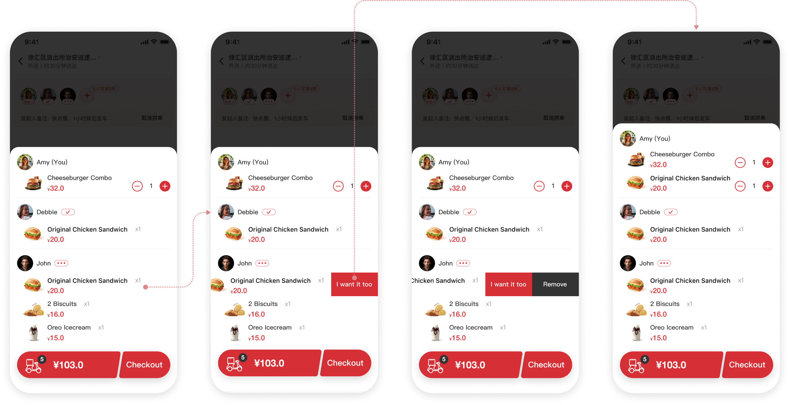
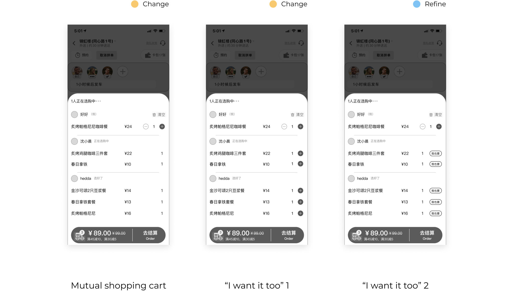
During the synchronous ordering process, I identified a common behavior through observation and interviews. Users tend to look to their friends for guidance when faced with a difficult decision. This social influence is so ingrained that when we see someone ordering something, we often follow suit and say, "I want it too!"
After conducting thorough user testing and design reviews, both our client and users were thrilled with the new feature. In order to provide a better user experience, I decided to create a new button for the Chinese version of the app. However, due to the length of the English text, I opted for a swipe interaction pattern to keep the page tidy and clutter-free.