Rebuilt the Information Architecture of dashboards, and created an intuitive Condition Filtering experience with scalability across all modules for municipal personnels.
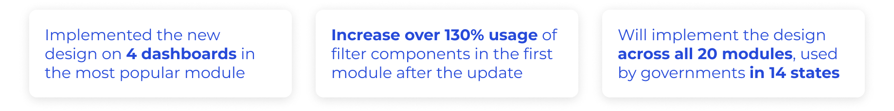
Received positive qualitative feedback from users; increased 130%+ usage of filters in the first implemented module; will be implemented in all 20 modules.
Launched in Feb 2023
Oct. 2022 - Dec. 2022
CPO & Product Manager (2)
CTO & Software Developers (3)
Customer Success (1)
Sole UX Designer
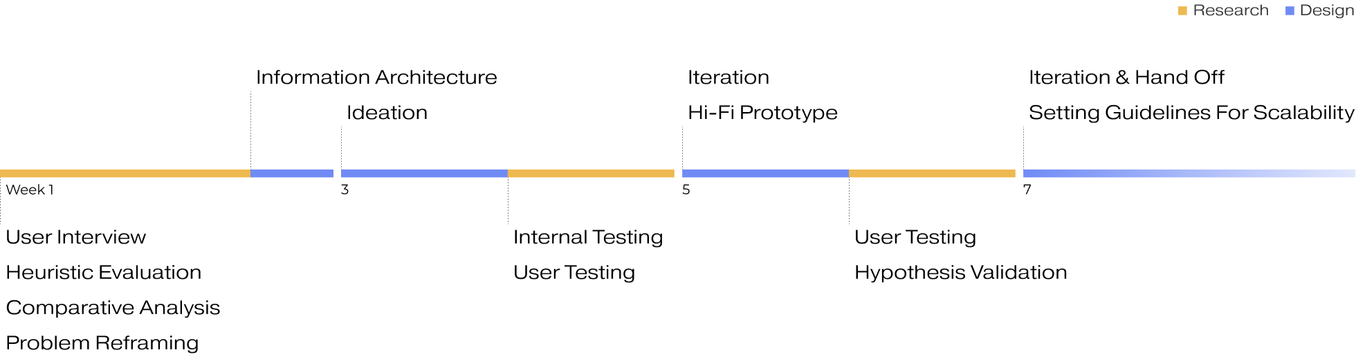
Over the course of 2 months, I divided the project into 4 sprints, redefined the problem and scope, conducted 2 rounds of user testing, and implemented scalability rules. Throughout the development process, I worked closely with the development team to continually improve the backend logic.
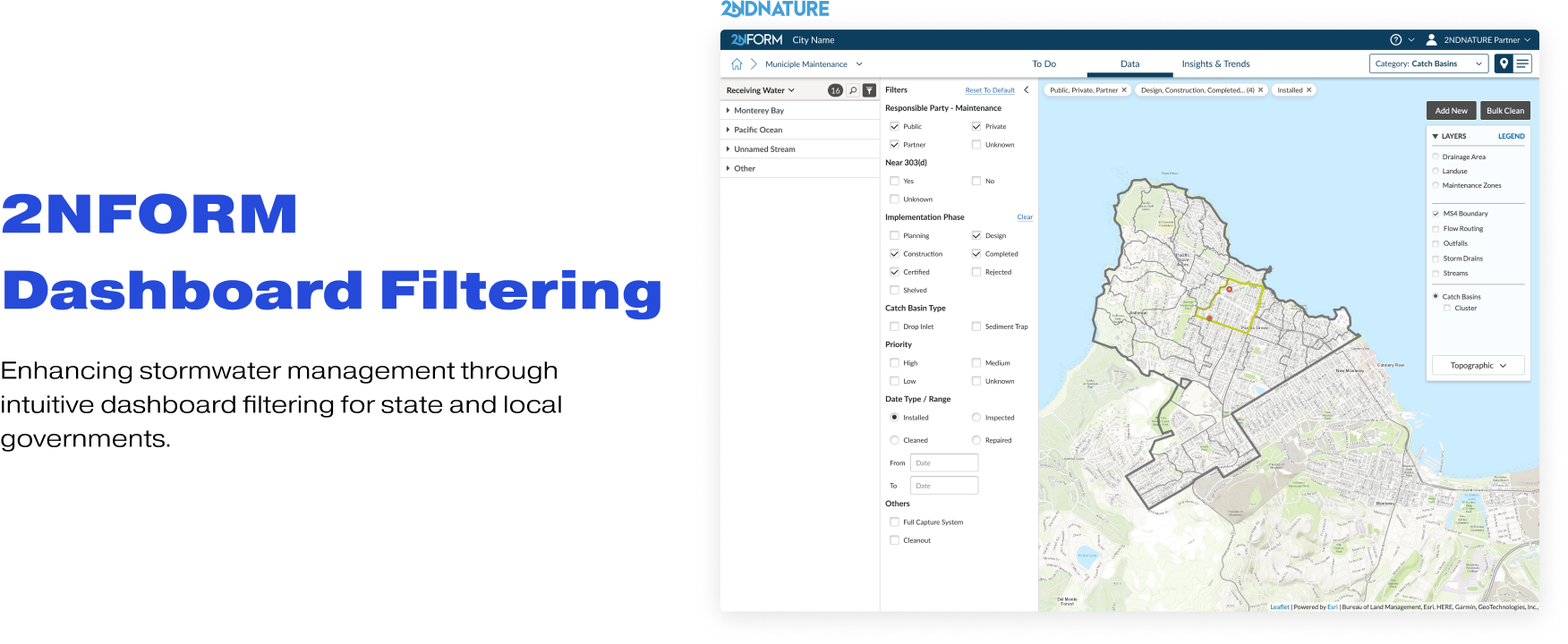
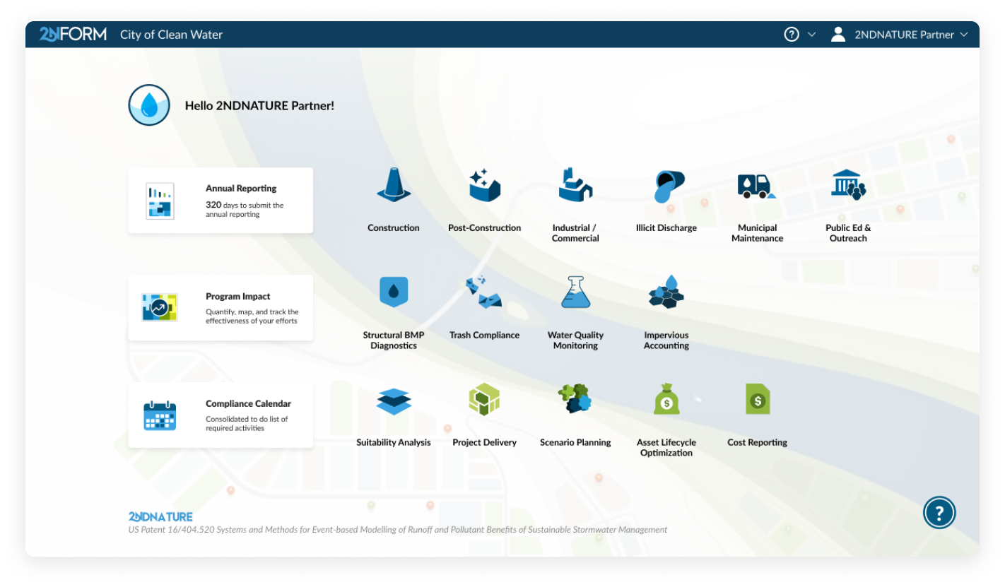
2NFORM is a SaaS web-application designed for stormwater management and compliance
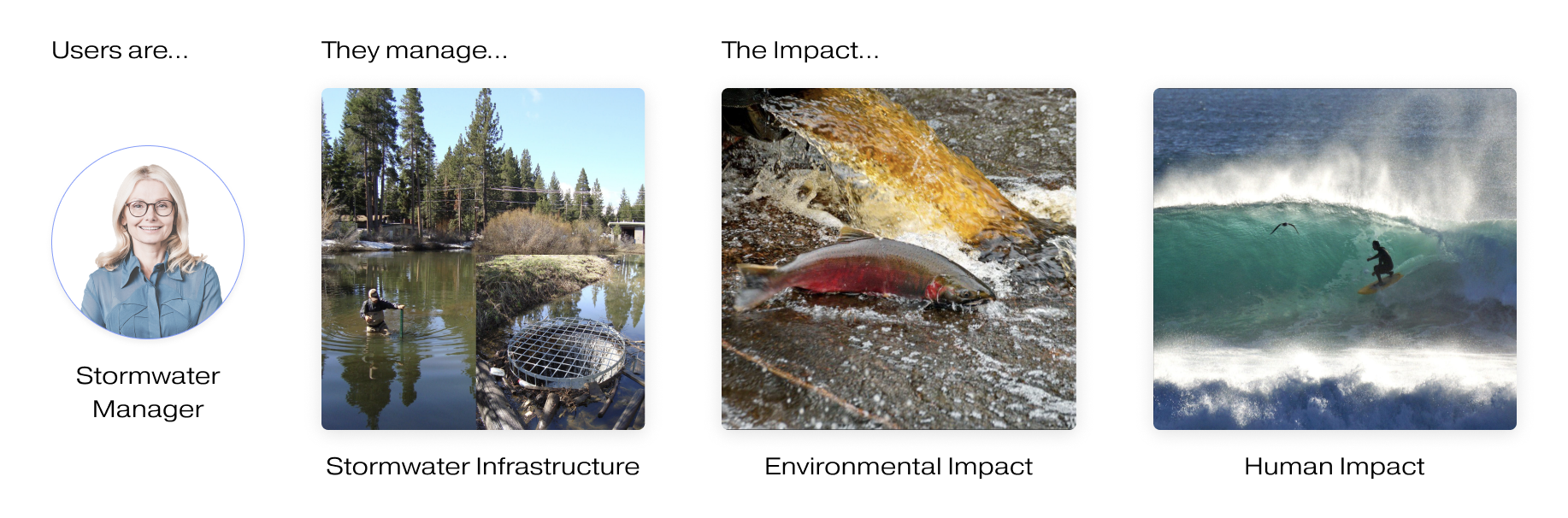
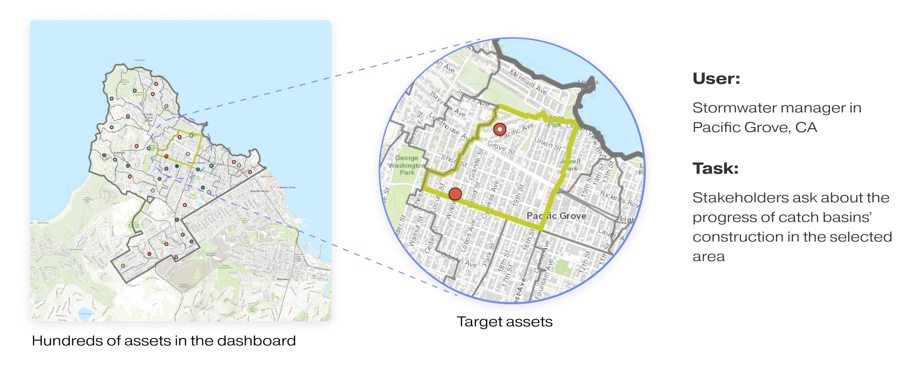
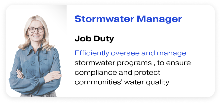
Users are municipal personnels in state and local governments across 14 states
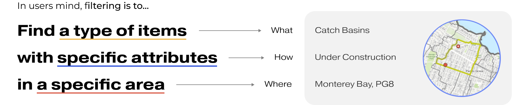
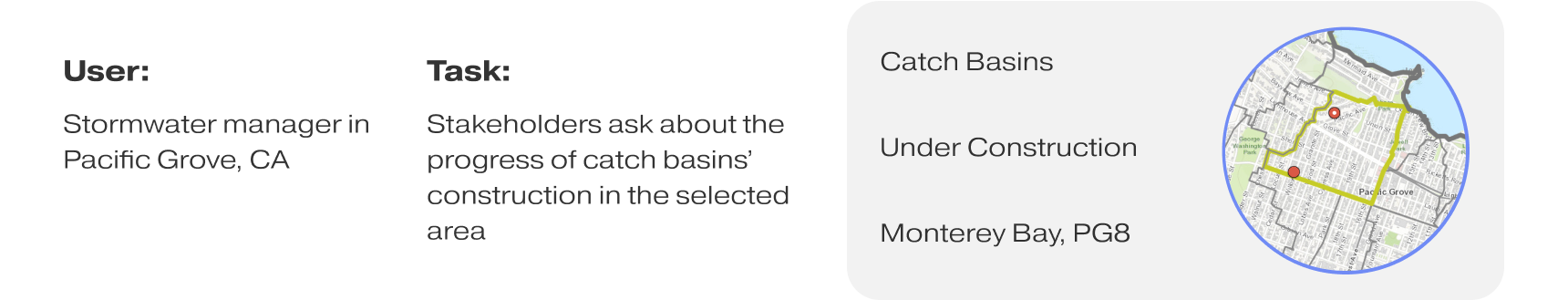
For our users, filtering is the very first step for stormwater managers to find items they need to work on and proceed with any tasks in their everyday work flows. However, they said...

Original Filtering Experience For Data Tab
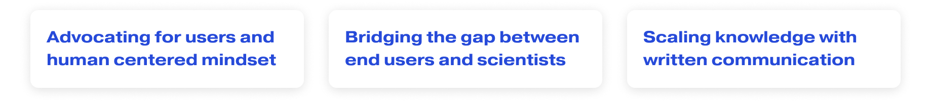
View Improved Design- Properly display filter/sort/search status for users
- Improve user experience and satisfaction with filtering across modules (maps and lists)
- Enable filtering and spatial grouping in To-Do page for custom short term lists
- Implement a scalable and reusable layout pattern for consistency between tabs and views
- Enhance data analysis capabilities with improved sidebar and filtering system
- Improve scalability by handling more data and bigger customers effectively through better filtering process.
I conducted semi-structured interviews with four Stormwater Managers in the government to understand the problems.
Objectives:
How do stormwater managers understand and user dashboard filters in their daily work?
I conducted a heuristic evaluation and comparative analysis to examine our product and how other companies address similar situations. I also mapped out problems based on my finding, user feedback, and interview data to highlight issues. After synthesizing my research, I identified two primary user problems.
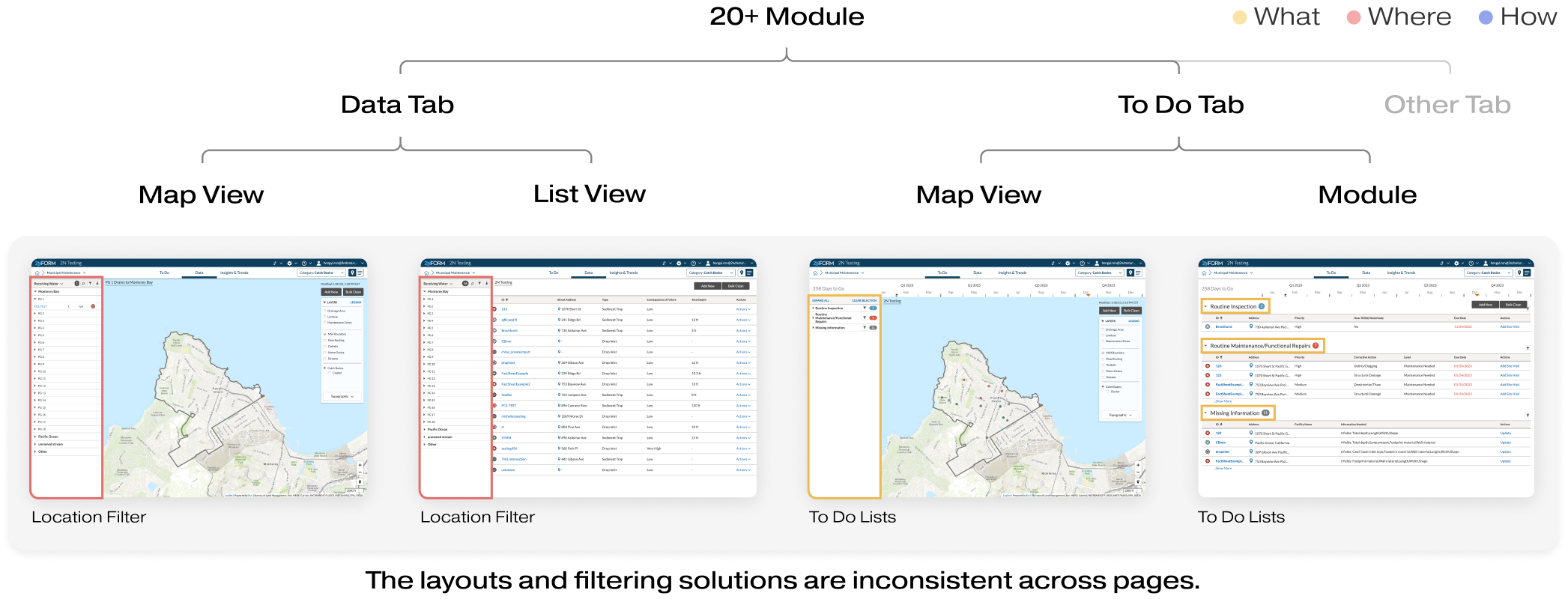
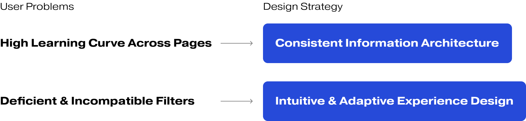
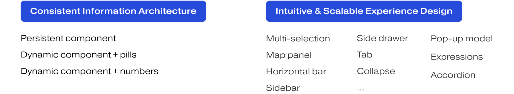
The product has over 20 modules, each featuring at least 4 types of dashboards with inconsistent layouts. And the interaction patterns for filtering are different on various dashboards. The inconsistency in Information Architecture and interaction led to users confusion and high learning curve.
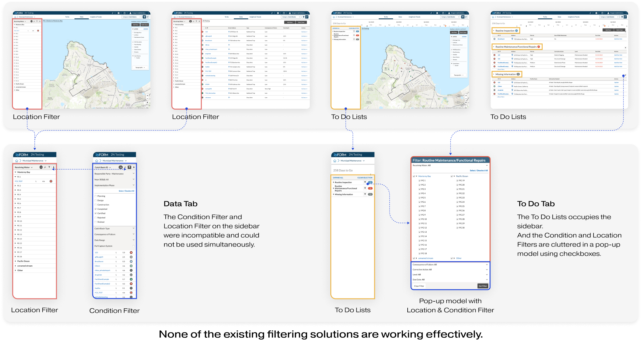
Though there are different layout and interaction patterns, none of existing filtering solutions are really functioning. Certain filters are unusable and users ultimately abandon the entire dashboard.
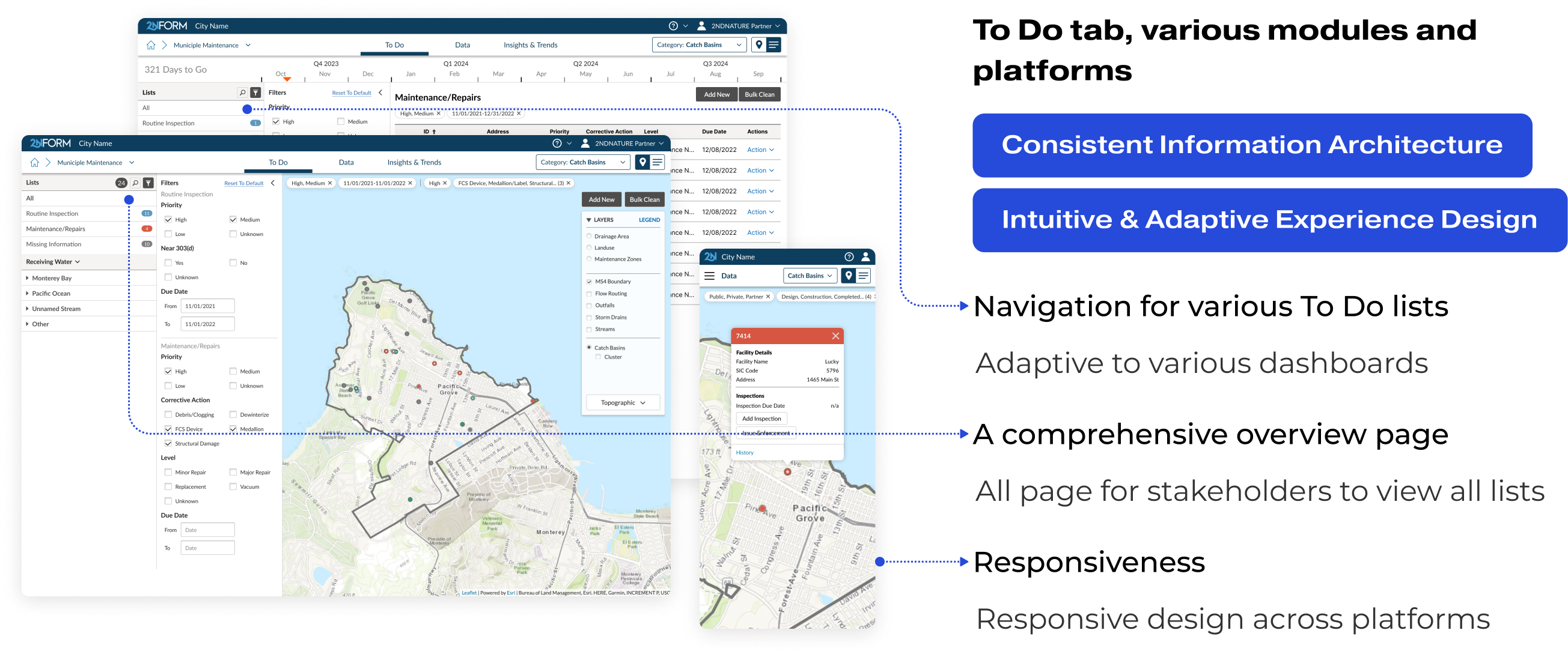
To design in context, I chose Municipal Maintenance Module as the template module to rebuild the dashboard's IA and filtering experience. Because Municipal Maintenance is one of the most widely used module, with the most comprehensive filter sets for all pages.
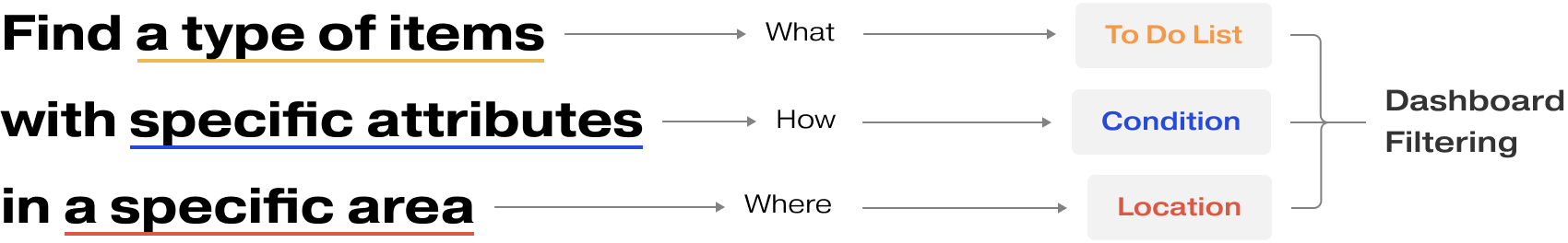
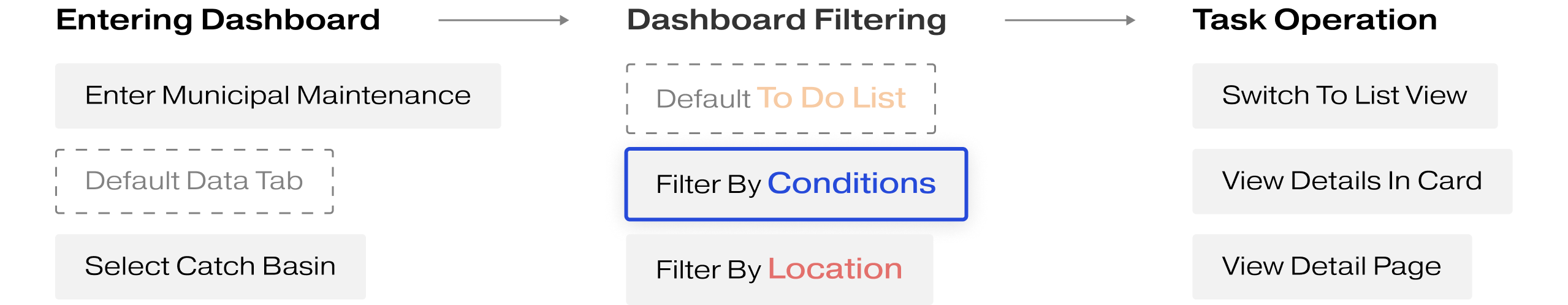
To align with users' understanding of filtering, I worked with the product manager to conduct a card sorting exercise, categorizing dashboard information into three perspectives: To Do List, Condition, and Location. These categories comprise the Dashboard Filtering feature.
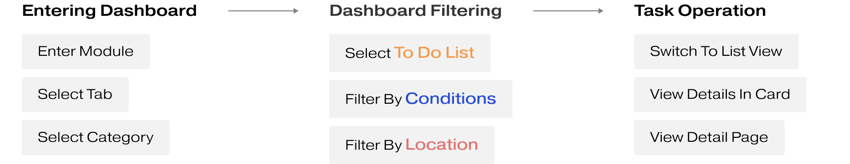
I introduced the concept of the "Dashboard Filter Set," which consists of three thoughtfully designed components that align with users' mindset and can function both individually and collaboratively:
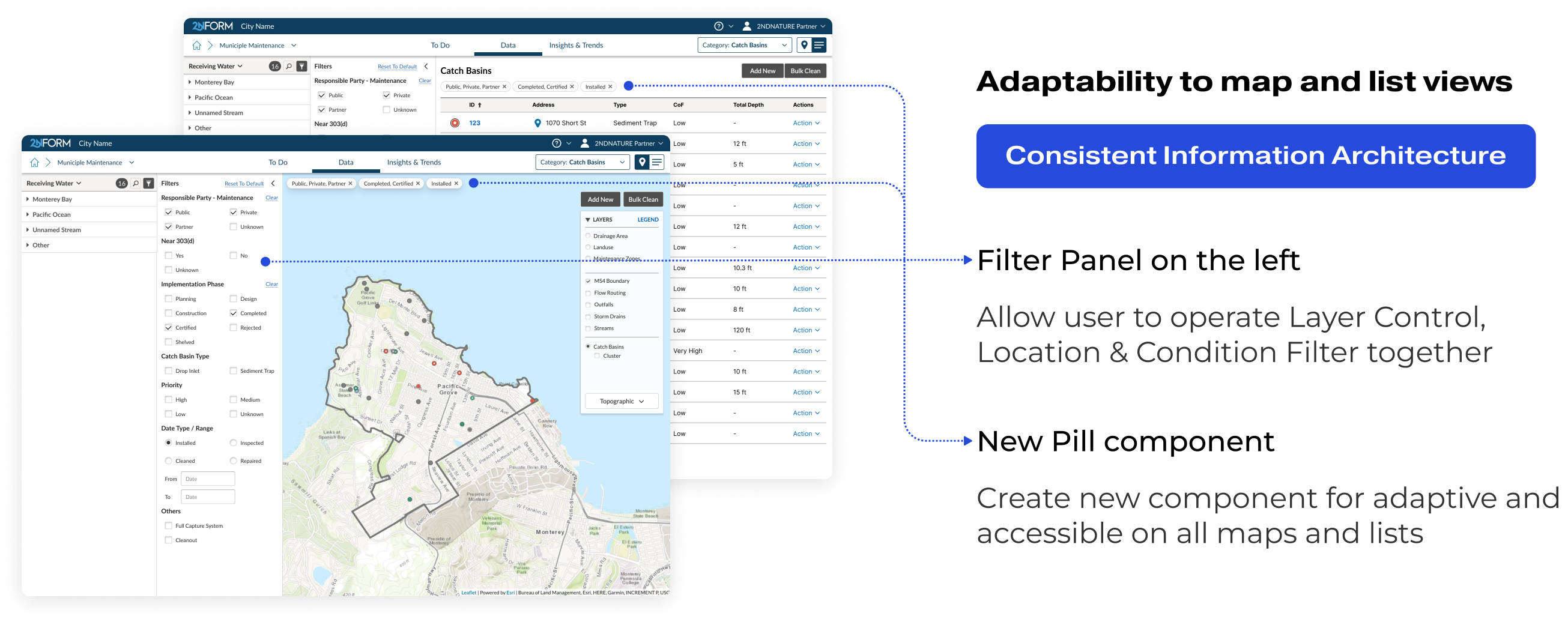
- List Panel: I designed a new list panel in the sidebar featuring To-Do tabs for better navigation and task management.
- Location Filter: We retained the widely adopted Location Filter in the sidebar, which offers an intuitive map-based interface and reduces the development team's workload.
- Condition Filter: As the most complicated component, it required a meticulous design approach. I will elaborate on how I crafted this filter from scratch in the following Challenge 2.
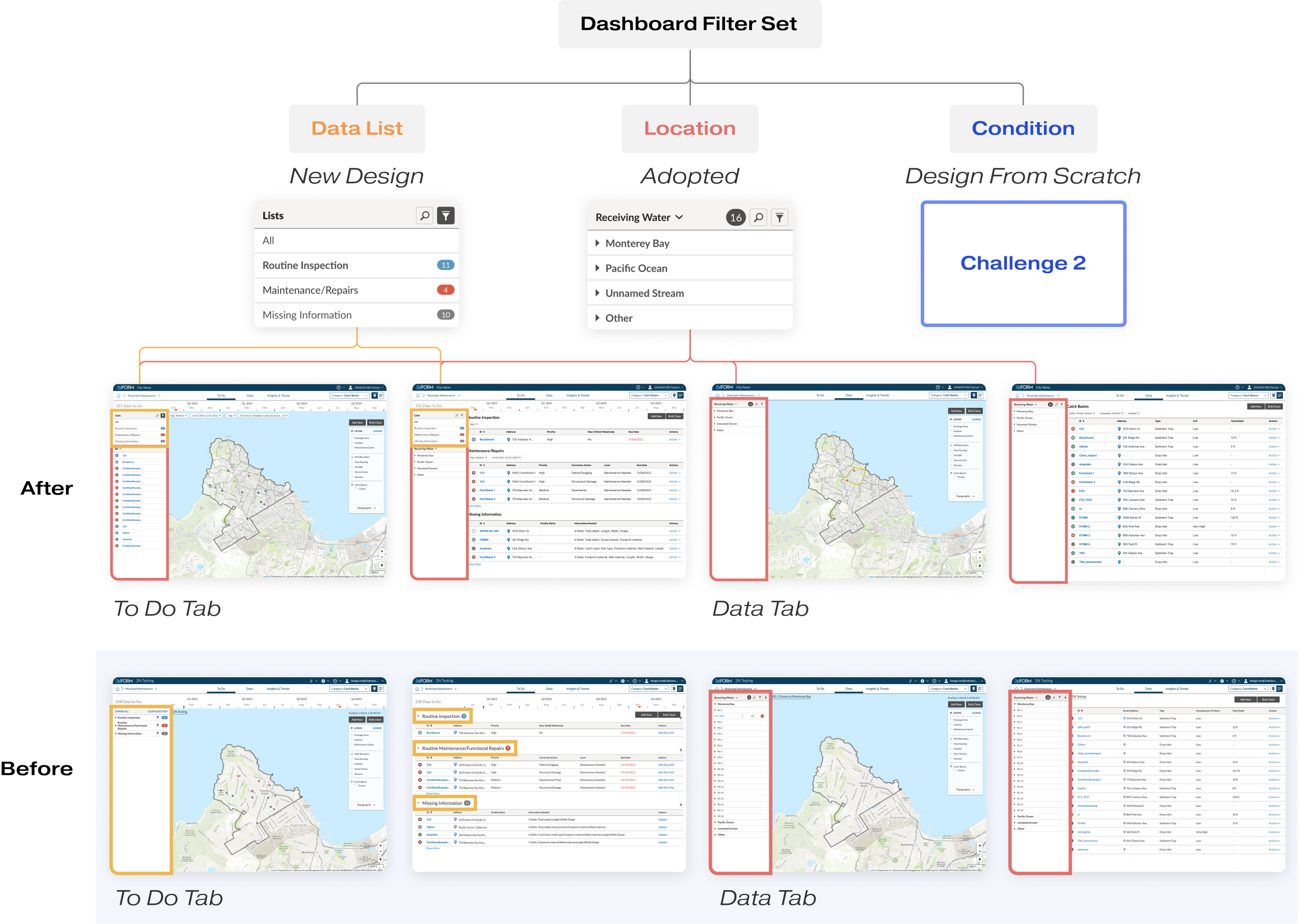
In the Municipal Maintenance Module, I selected the Data Tab, Map View as the primary context for ideating and designing the condition filter. This decision was made because this dashboard accounts for more than 80% of usage and offers the most extensive set of filters. Simultaneously, I evaluated my design for adaptability across other dashboards to ensure a cohesive and versatile user experience.
For challenge 2, my focus was on creating a universal solution for Condition Filtering, as the most important part of the intuitive filtering experience for all dashboards.
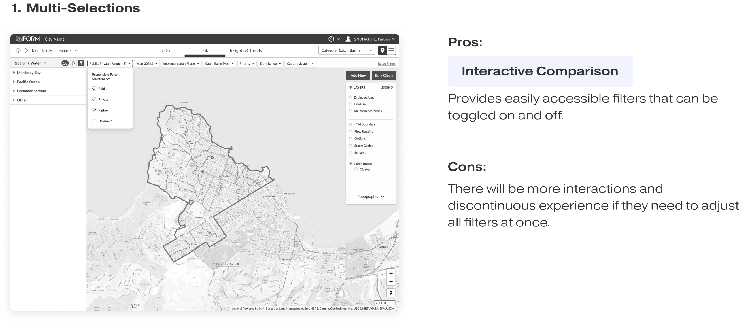
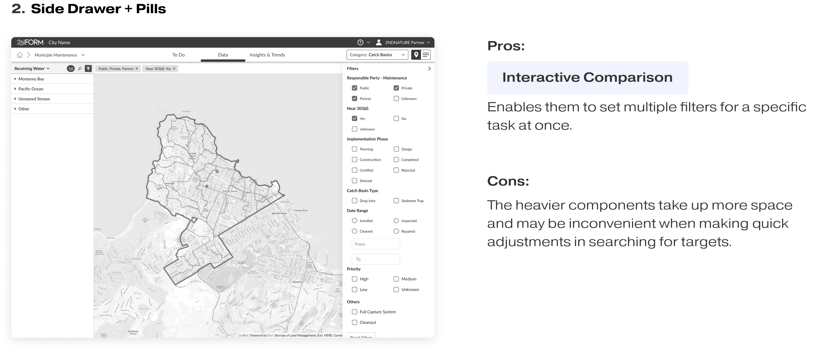
To ensure adaptability and scalability across tabs and views, I explored various possibilities and ideated with the two design strategies, Layout and Interaction, to explore all feasible combinations, and evaluated them with users' needs and behavior patterns.
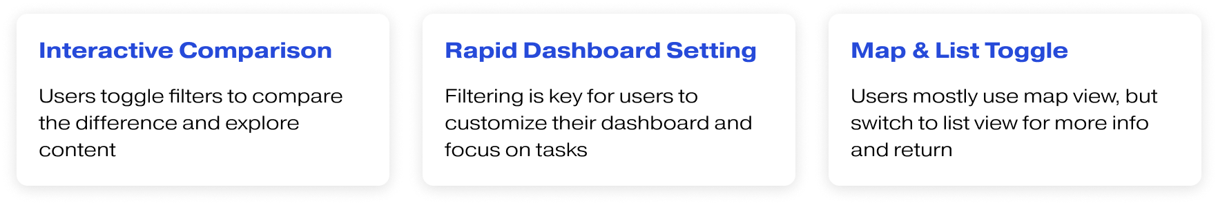
I evaluated all the ideas by considering user needs and three main behavior patterns across pages and modules. This ensures that the solution is intuitive, reusable, adaptive, and scalable across the product. And there are two concepts that stand out in the evaluation.
Internal Testing
During our internal testing and concept review sessions, 3/3 people favored concept 1 due to its sleek and concise design, like "Why use 2 components if we can solve this with just 1?"
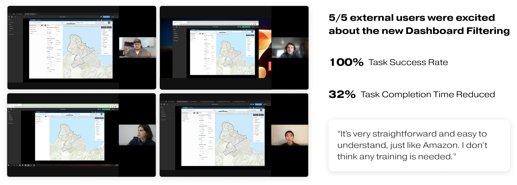
However, they are not the actual users. I reached out to the customer success team to organize and conduct external user testing. The result of this testing was surprising to all of us.
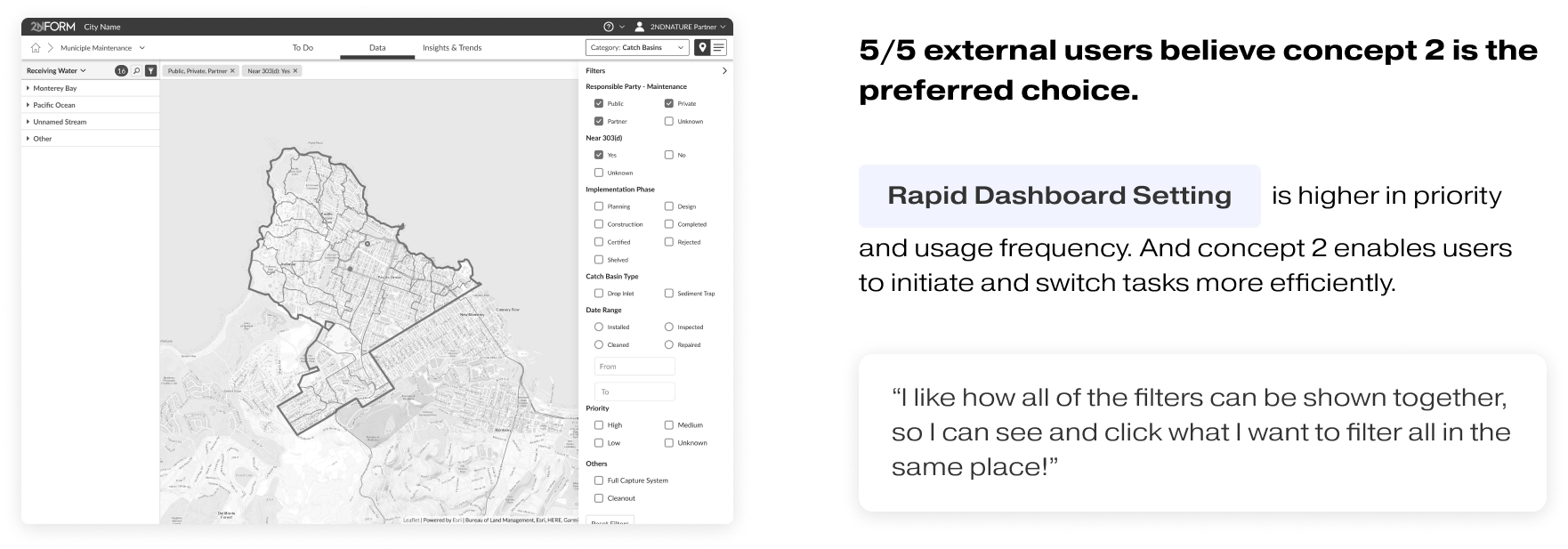
Through this user testing, I successfully demonstrated the significant value of user-centered design methods for our company. Based on the two rounds of user testing for this project, I established a comprehensive standard operating procedure (SOP) for conducting external user testing within the company.
In second round of user testing, my objectives included:
- Evaluating the quality of the filtering design in the Municipal Maintenance module in various use cases.
- Assessing the adaptivity and scalability of the filtering experience across the entire platform.
- Validating that the filtering logic resonates with users' perspectives and facilitates intuitive interactions.
I also validated design decisions and addressed developers' questions about back-end logic with a user mindset.
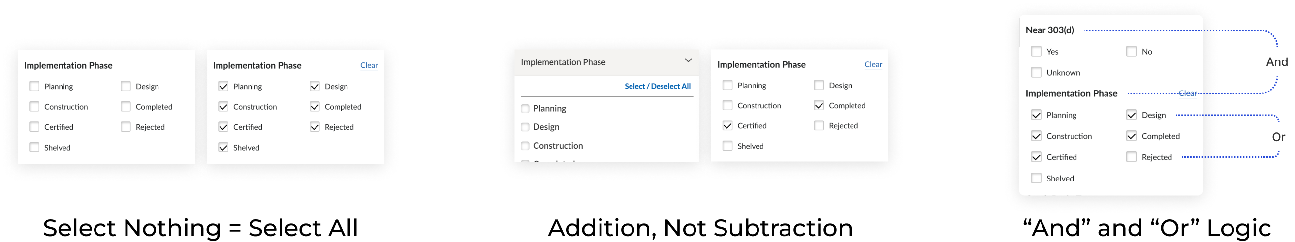
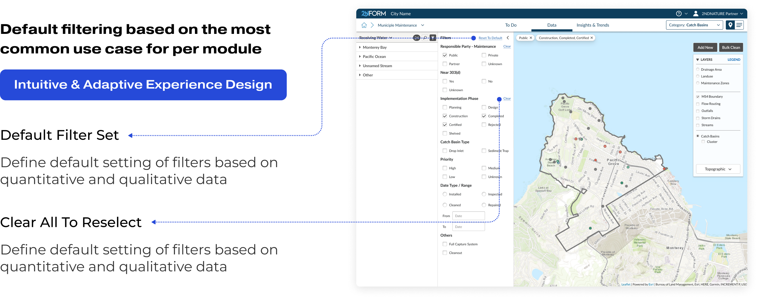
Then I adressed key "What-If" scenarios, and developed a scalable guideline for implementing filters across all modules, including:
- Distinguishing between Filters and Layers in terms of purpose and logic.
- Assessing criteria for attribute or value inclusion in filters.
- Defining rules for filter removal or disabling in different contexts.
- Addressing the handling of [null] values within condition filters.
- Promoting a user-centric approach, with emphasis on accommodating users who are not familiar with technology.
And we received a lot of positive qualitative feedback on the ease of use of the new version of filters and the To Do tab dashboards.
- Properly display filter/sort/search status for users
- Improve user experience and satisfaction with filtering across modules (maps and lists)
- Enable filtering and spatial grouping in To-Do page for custom short term lists
- Implement a scalable and reusable layout pattern for consistency between tabs and views
- Enhance data analysis capabilities with improved sidebar and filtering system
- Improve scalability by handling more data and bigger customers effectively through better filtering process.
- Implement the dashboard filtering experience across all modules
- Enable user customized filtering presets
- Introduce Global Search and Fuzzy Search